Hey Guys,
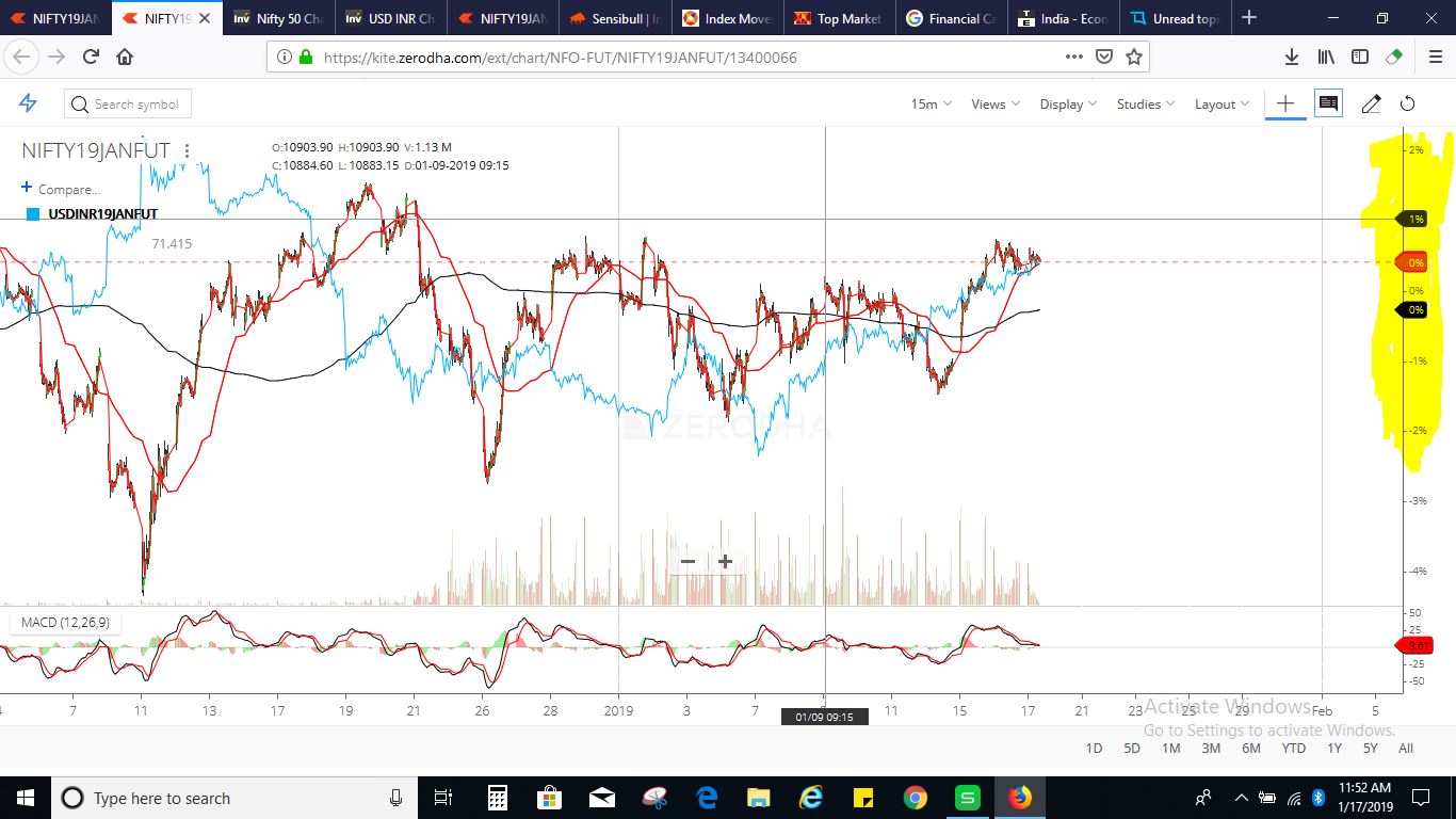
Please Look at the snapshot attached, I am comparing USD/INR to Nifty 50, now i know how this comparison can give cues about Nifty’s trend. But i am just Curious as to what those number (% Figures ) on the right scale mean? And how to interpret this information.
I have highlighted the information on the screenshot, i just want to know what these % figures mean?
Thanks in advance,
Vijaya