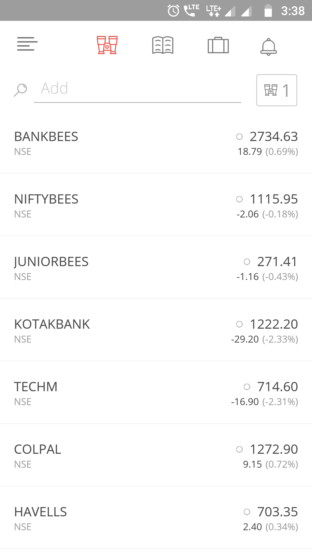
I’ve always had some difficulties in browsing my Watchlist (Marketwatch) in Kite. I use a small phone (just 5" screen-size) and I also have some vision issues (wear progressive glasses). I find that font size used in Kite app Watchlist is way too small for some readers.
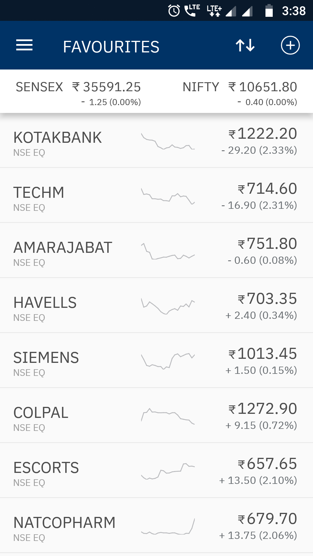
I also have another trading account with a different discount broker and I find their app feels easier on my eyes. I mostly look for the ‘%’ change in a scrip, which is usually given in a smaller font within brackets.
I also want to have a sorting feature enabled in kite Watchlist, so that I can sort them by name, price, and % change… up and down. It’d be great if we can set multiple watchlists in Kite app.
For comparison I’m attaching two screenshots of the Watchlist of Kite and another trading app. The Kite one does really need some UX changes here and there.
I hope this requested change in look and feel is implemented by the team at the earliest.