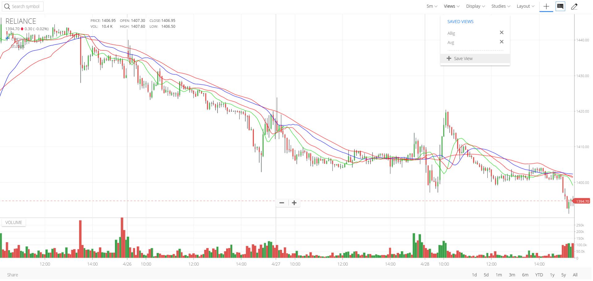
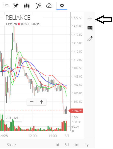
Save templates/views with ease. Add studies and indicators and save as view. Load any other scrip and select the view to apply the same set of studies.
1 Like
Please make night view ‘black’ instead of blue or please let the user select if he/she wants it to be black or blue.
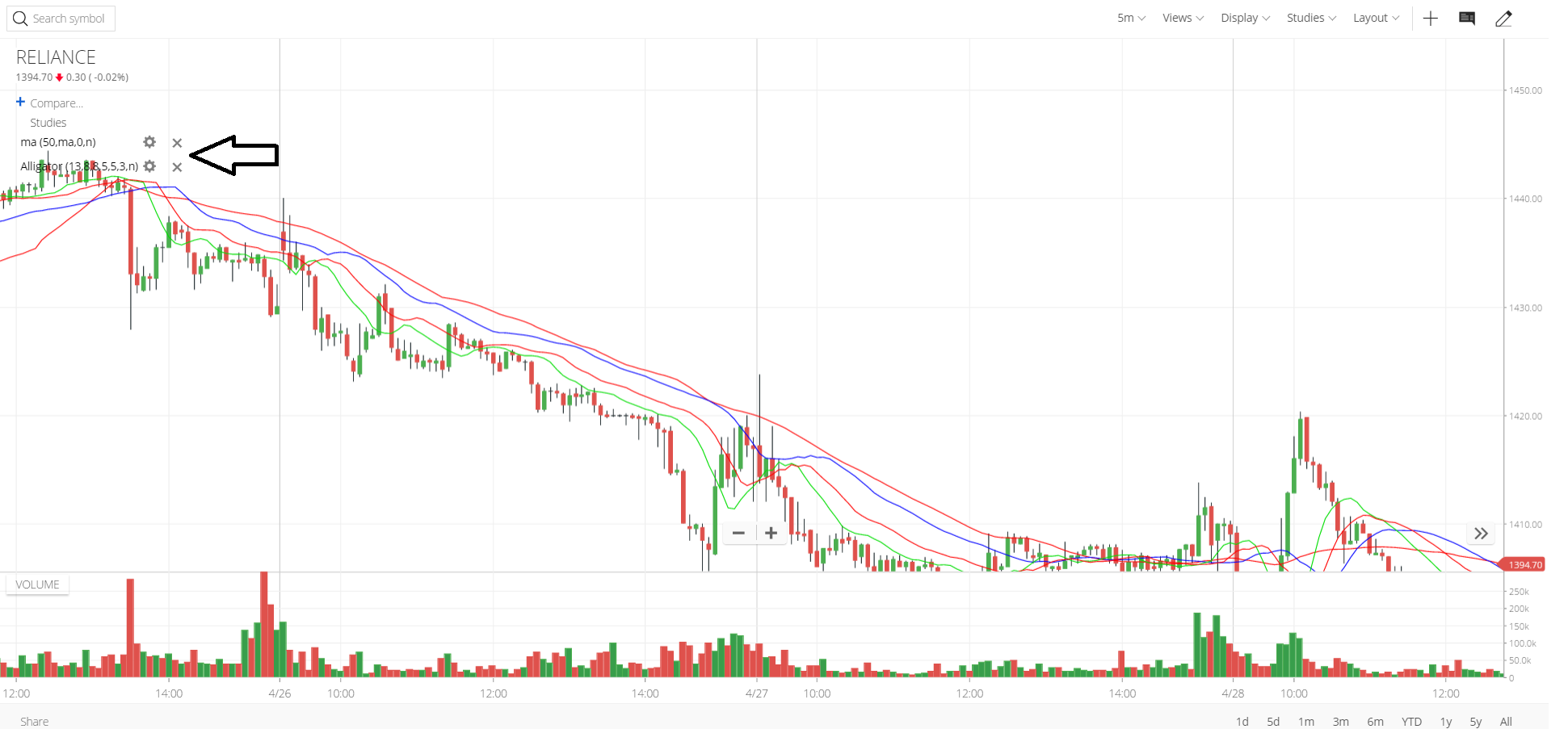
Easier to remove studies/indicators, right from the panel.
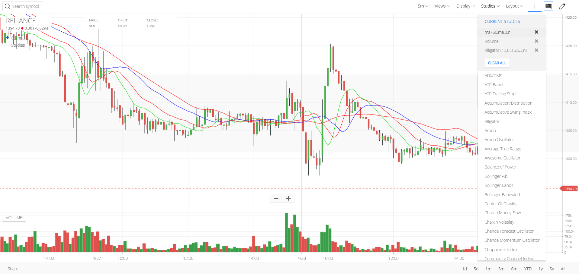
Another easier way remove studies or change the settings
We are working on enabling the search feature and showing indicator points on right axis of the chart.
If using charting on mobile, keep crosshair and info box disabled for better experience. It wasn’t possible earlier to draw on the mobile app.
Required to swipe left/right on the mobile screen to see more data. If crosshair/infobox/drawing tools enabled, two finger swipe to drag the chart left/right.
4 Likes
Hello,
There few concerns on the new update.
- I cannot see exact levels of moving averages and other indicators on y axis.
- Once I set time frame to let say 15 min, it automatically switched to 1min when i pop out the window.
- Info box details are overlapping the charts. It would be better if it is done in previous way.
- There is no search panel in studies bar. I have to scroll it to last if i have to use indicators like super trend etc
1 Like
1/2. Looking at having this fixed.
3. You have two options of info bar. The second option doesn’t overlap. Check the screenshot above.
4. Yes, looking at sorting this soon
There is no black theme in Android app.time frame default is 1min though I saved 10 min several times.lot of overlappings.please make it user friendly.

Elder impulse indicator : If i plot this the bullish bearish and the neutral bars shows me only black bars,it should show me green for bullish, red for beearish and blue for neutrl but this doesnot work
please fix this
Looking good but some concerns are here:
- there should be some area reserved for horizontal line marking and other drawing on right side of the chart just before y-axis.
- Why there are two different areas for time period? one at top of the chart and another one at bottom right of the chart ? they could be adjusted at the top of the chart too and share button can also be adjusted at top. and bottom area can be used to show more screen area for chart.
- buy and sell marker with stop loss on chart can be another top feature. in which stop loss can be directly adjustable from the chart.
however they are trying their best to deliver what is expected always from a tech company bcoz zerodha is more tech than a broker.
Best wishes
How can i change candle color I dont see any option where i can change the chart candle color.
Agree with your concerns, i hope zerodha fixes this issues ASAP.
Hi Nithin,
thanks for a wonderful update can you please let us know how can we change the candle color as i am not able to find the option.
Hi Nithin,
I joined zerodha, due to its simple look and style which was very impressive and fast to load. But looking at current makeover, it seems Zerodha team making it little vibrant and heavy too.
Earlier view was very good and with full of required things in charts with no complaints earlier.
Cons in current design:
1.We can not type and search indicators in charts
2. When we scroll graph to left side to check old candlestick chart, it was earlier showing date somewhere in top or right side, but now we have to enable crosshair curser and take it on candle stick to check, which date, we are on the graph
3. Volumn graph is pasted with glue to all charts. Even if I remove and save view without it, it again appears when I navigate graph from one script to other. There is no way to get rid of it.
…
I could quickly note these many changes. I am afraid now since I am not sure how I will trade with new chart system. Please gimme best luck.
Regards,
Rupesh
5 Likes
I agree with you Rupesh. Earlier version was so simple and easy. Zerodha always gives us good updates and I really appreciate for their hardwork but this time it seems they made it more complicated. There was no need of separate crosshairs and info button. Looks like there are many unnecessary changes. I started feeling uncomfortable about trading with new update.
3 Likes
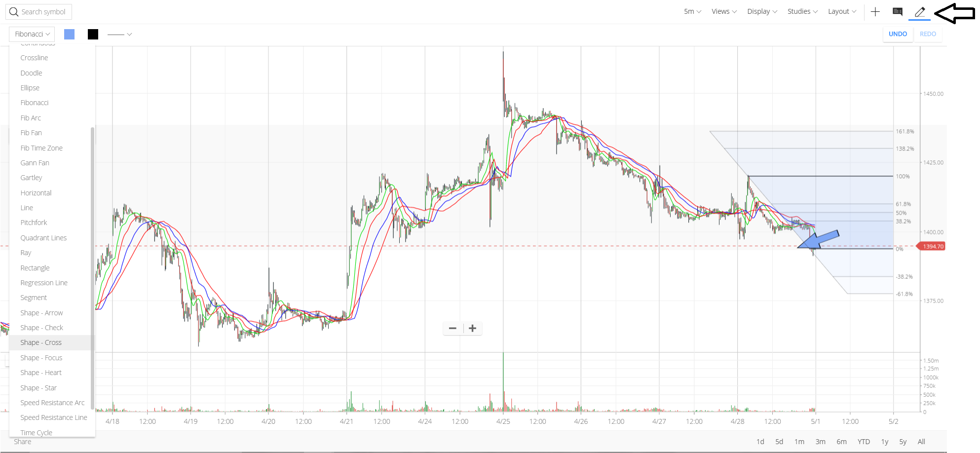
It seems that the refresh button is missing…plus the fibo tool does’nt hav options to add custom levels…bringing both of these back would be great
3 Likes
Also I am using iPhone 6 Plus. Earlier version itself was little cumbersome to operate, in comparison to android version, but somehow I took over it.
Now with the latest changes, scrolling up and down is completely restricted. We have to look at unaligned view, in IOS.
Portrait and landscape mode, in IOS, lagi padi hai dost…,
Looking at the changes, it seems there wasn’t any necessity to get a makeover at all. Atleast I am not seeing any good addition of feature, which was really missing since long time and added now.
There was always a change required in terms of good app in IOS. But the new look is quite a overhead to operate and making me uncomfortable to work on Kite on longer time.
Regards,
Rupesh
There are some issues with this new charting system. You could have restored the old chart settings from the database. For a newbie like me, loosing old settings means starting all over again.
The most serious problem is - Chart Settings (preferences) are not being saved. After login, I have to create the chart by entering each study manually. And changes are not saved even after pressing “Save Preferences”. I tried it with different browsers. This is fraustrating. Unable to close Volume section permanently. I prefer to close Volume, as it frees up the precious screen space.
Before implementing changes, you should test changes through a beta. That’s how changes are implemented in busy websites. To avoid overlaping the bars, you can use transparent background for the title and info box. Allowing users to customize the colors would be great. Or at least provide a good dark theme.
Hope your developers are working on the issues. Please don’t ruin an otherwise almost perfect system!
4 Likes