The ones you’ve mentioned are things we’ve already tried. While using CSS may appear straightforward, the outcome impacts platform-wide design consistency.
I might not have explained it clearly earlier, but in the screenshot you shared, the empty space in the middle is actually a result of trying to forcefully rebalance the layout.
This much space would not be there on Kite without these changes.
When you reduce side margins without changing the content or font size, that space doesn’t disappear — it just spreads between data columns. That leads to more horizontal eye travel, which most users find less comfortable. From a UX standpoint, central alignment with balanced padding tends to offer a better reading experience.
What’s the solution?
This challenge is better addressed when the screen is filled with meaningful, modular content — for example, a chart (which scales naturally), or a multi-pane layout with Marketwatch, chart, order book, and positions side by side.
As I mentioned earlier, we’re actively working on this through a dedicated terminal mode feature, which is on our immediate to-do list.
If you need any further clarification on this, please DM your client ID. I will arrange a callback for you.
Excellent effort! The idea of grouping within a watchlist and pre-defined list is ingenious.
I would like to see similar grouping in Positions too. Currently, all positions are listed in a flat list. I would like to group the positions based on underlying stock or commodity.
@siva It currently works only for Holding and not for F&O. Request you to please allow it for F&O trades as well for the time being, as Team Z is working on a new tagging feature.
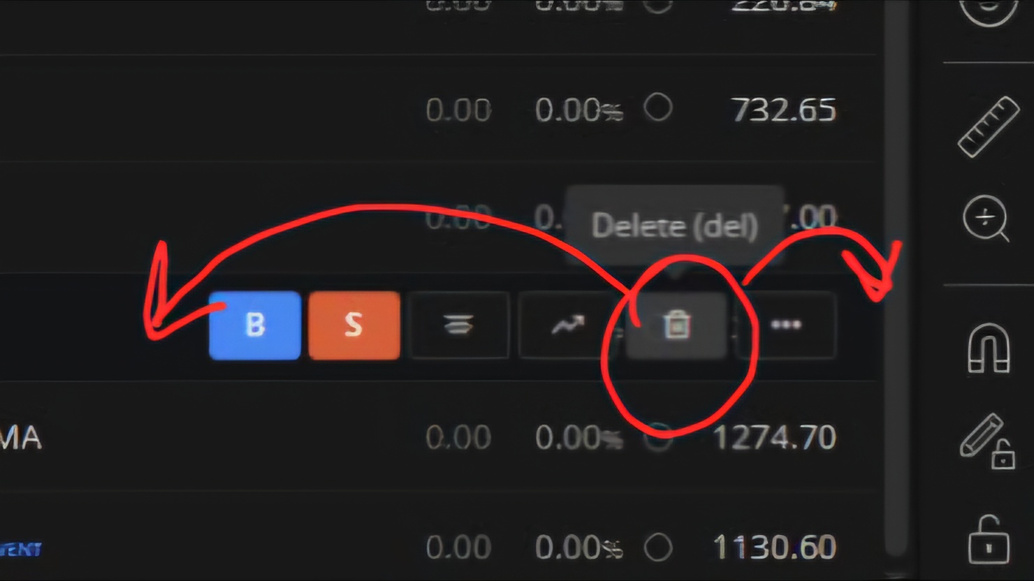
Can you guys please adjust this delete button left or right. Because sometimes by mistake we click on this and script get deleted. Or make a delete confirmation popup.
guys its a request to increase the number of scripts in the watchlist. Currently, the limit is set to 250 scripts, which often proves to be insufficient for my needs. When we run scans, we sometimes get over 600 stocks intraday that match our criteria. However, due to the 250-script limitation, we are unable to fully utilize the scanning results and effectively track all potential opportunities, please
please allow to add stocks from the scanner like chartink, streak , by one click copy the scan stocks and paste in watchlist or we download the excel file and import
3.if possible please give us the option to change the watchlist position from left to right
This feature would be very helpful for intraday traders. Please consider it.
Currently it is at 100,we are making it to 250, for now this will stay, in your case you can add maybe in 3 watchlists.
Yeah, this makes sense, will check with our team on possibility of doing this in next version updates.
Not possible now, once we offer terminal mode where users can drag and drop any widget they want to see as their front end this request will be addressed, we are working on it, no ETA though.
If possible, please try to increase the limit beyond 250. Constantly switching between watchlists takes time, and during intraday trading, every second counts. i understand but please try