Hi,
This post is related to ChartIQ Desktop/Web version.
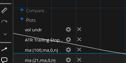
This section is unnecessary and problematic.
“What we use N number of times in a day, must be as perfect as possible”
What creates N number of irritations in a day, must be corrected.
Reasons:
- We do not change plots/indicators every now and then.
- This option is there under “studies”.
- This option could have been meaningful if the option to toggle on/off the visibility of the studies/indicators.
- Even if the cursor reaches within 2-3 cm of the toggle triangle, the region becomes activated. At least lessen the activating region. Better make it activated only after someone “clicks” the triangle. (My suggestion still holds. and that is remove the section FOR NOW)
- When I try to use ‘multiple charts’ feature, this particular issue makes the multiple charts ALMOST totally unusable as every now and then it will get activated and hamper other actions. Please try this particular issue yourself.
Hope the above resonates with you too and above corrections improves zerodha even further.
Thanks and Regards.