when will terminal mode can go live ?
1 Like
The project is currently undergoing testing and is expected to enter beta by next month.
3 Likes
Tareekh pe Tareekh
3 Likes
Any update on this? not yet visible.
@srikanthkaramsetty Everything appears to be functioning correctly on our side. Could you please send me your client ID via DM? I’ll have a team member contact you to investigate further.
Hi,
I am referring to the revamped mobile charts. I haven;t got this update in the kite app.
It should be available to everyone by this weekend. Already rolled out to 75% clients.
2 Likes
Hi,
What’s the point in showing market depth icon for indices? Instead, it will be more useful if it can be replaced with option chain icon. Also, if we can get direct access to option chain from the option charts as well, it will be more useful.
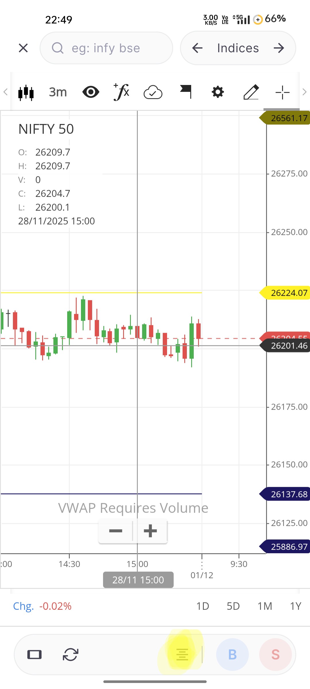
The market depth icon is a universal placeholder that appears across all instruments, but it will not open for those that don’t support depth data. Additionally, we do have plans to allow accessing the option chain from the charts, which should address your requirement.
If the market depth icon can be removed or hidden from the non supported instruments, mostly the indices, pls do. Kindly bring option chain accessibility asap
3 Likes
The placement of the search and the next/previous arrows are at an awkward place.
they would be much better positioned at the bottom. (when phone is held in portrait mode they are unreachable at the top.)
a search icon that expand the type-able text area. and next previous buttons.
moving the portrait and landscape icon at the bottom, user is going to reposition the phone as he/she about the click the button so it can be reached by the other hand.
The trading panel is currently positioned at the bottom, featuring buy (b), sell (s), and market depth buttons, and another panel below it; unsure how it will look. The search and next/previous arrows do not fit cleanly on the existing bottom panel, especially on small-screen mobile devices. Your feedback is noted. We will check if there is a better solution possible for this.
@Arockiya_Raja here is a bit detailed thought on the rearrangement.
- move the portrait/landscape toggle at the top right corner (if you are planning to view the chart in the landscape move you most probably holding it with 2 hands, that corner is well accessible with the 2nd hand)
- put the search icon (just a icon at this point) to the bottom left corner, next to it is the previous next arrow widget (same widget you have right now just re positioned next to search icon), next you have the market depth and the buy and sell buttons
- when user clicks on the search icon, it expands in a textbox, allowing user to type, the matches are visible in a dropdown (more like a drawer up in this case)
- if you are a mobile portrait mode user all the usual things you want to do on the chart (search, go to next/prev script in the list) check the market depth, buy or sell can be done using the single handed interaction.