Entire week struggled to get used to the new order window on the mobile Kite website.
Is it only supposed to be an aesthetic change? Or did I fail to see some useful new functionality.
The fullscreen window was so much better. This new partial window places the buy/sell buttons at the bottom of the screen, which gets hidden behind the keyboard. I first need to close the keyboard and then proceed with the order. Very inconvenient.
Besides, it completely ruined my muscle memory.
Please at least consider to make this optional. Would highly appreciate a setting somewhere to get the old fullscreen window back.
No UI changes are planned. The Kite web platform has been upgraded to improve accessibility and align with regulatory requirements. We will compare the previous and current designs and evaluate the feasibility of retaining elements from the earlier layout.
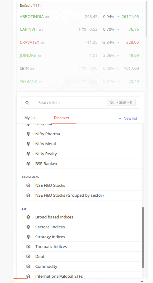
@Arockiya_Raja Can you please make just one click add of all FnO stocks on watchlist , manually doing it is very time consuming , plus the list keeps changing every now and then
One more thing I noticed is that, when the zoom value of the page is decreased, the order window becomes a floating box which can be dragged around.
If its not possible to bring back the fullscreen window on the mobile page, it would be very helpful if that floating box (on the tablet(?) page) could at least remember its previous position.
Currently, it always opens at the bottom (buy/sell button again gets hidden behind the keyboard).