With interest rates rising globally, some of the weakest corporates and zombie companies are entering troubled waters. Keep an eye out on the default rates, which haven’t spiked significantly yet.
Source: Invesco
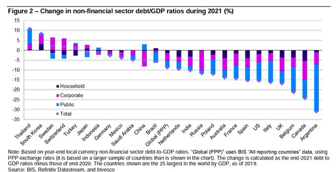
India is one of the few countries to have seen a reduction in total debt to GDP.
Source: Invesco
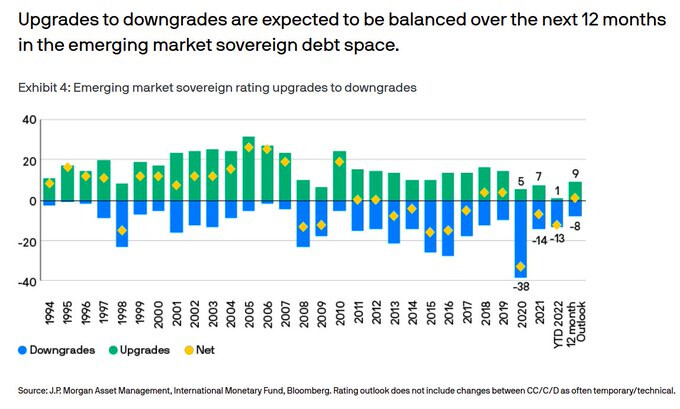
Emerging market sovereign upgrade downgrade trends.
Source: J.P. Morgan
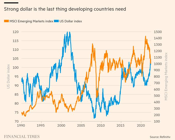
A strong dollar has been historically bad for emerging markets. It leads to lower growth and demand destruction. A strong dollar is also negative for commodity prices and also makes external debt payments costlier.
Source: FT
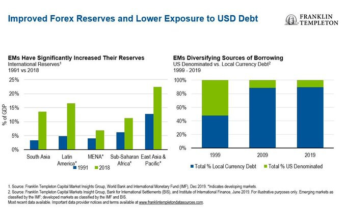
But the silver lining is that after the Asian Financial Crisis, the major emerging market (EM) countries reduced their dollar-denominated debt and expanded their local debt markets. So this time around, the larger countries are in much stronger shape.
Source: Franklin
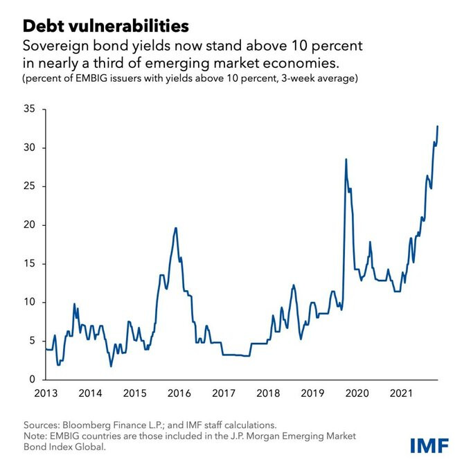
But the most vulnerable developing and emerging markets are in trouble. The percentage of developing and emerging market bonds trading above 10%–typically considered as distressed–has shot up significantly.
Source: IMF
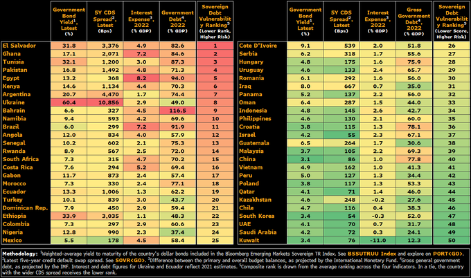
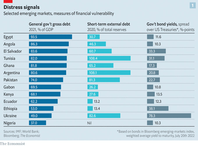
So, which are the most vulnerable emerging and developing countries? It’s countries like Egypt, Pakistan, and El Salvador.
Source: Bloomberg & Economist
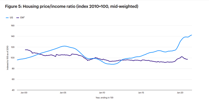
Now, for some good news. There’s a lot of talk about crazy housing prices in developed markets like the US, Canada, and Australia. But housing prices in emerging markets are much more subdued.
Source: Invesco
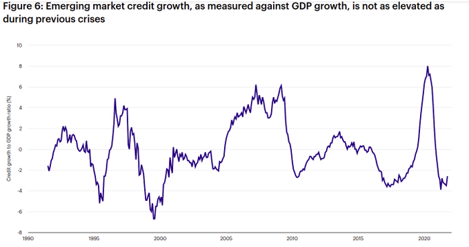
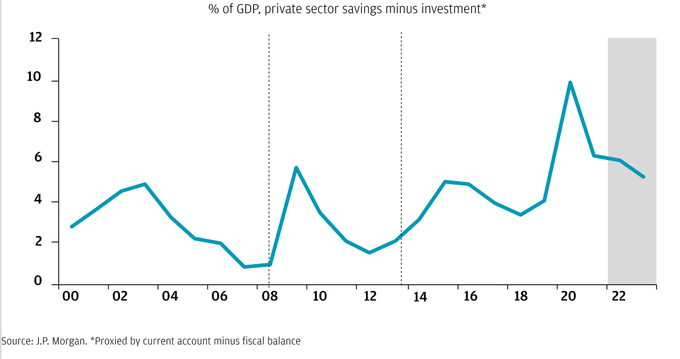
How about leverage? One way to look at it from the lens of credit growth, which is it lifetime lows. EM savings buffers are also relatively robust.
Source: Invesco, J.P. Morgan
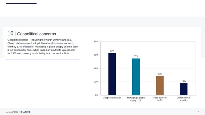
The biggest concern for business leaders are geopolitical issues and supply chain issues.
Source: J.P. Morgan
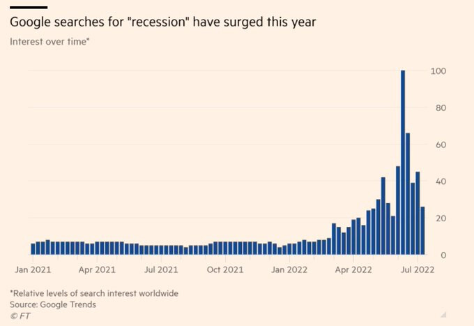
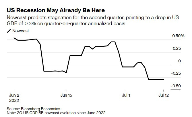
Will a recession become a self-fulfilling prophecy, just like inflation? Recession, stagflation, demolition?
Source: FT, Bloomberg
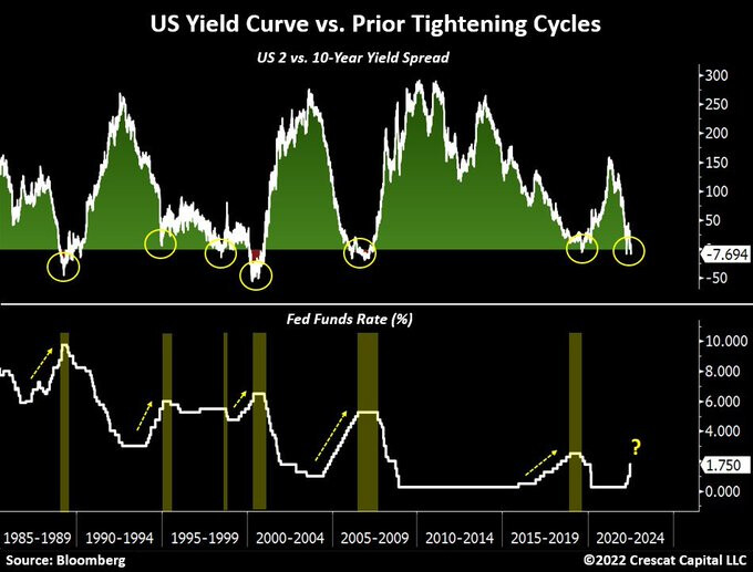
Most US recessions are preceded by a yield curve inversion. The US 2/10 year curve has inverted. Are we in trouble?
Source: Crescat
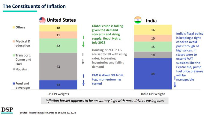
Drivers of inflation in India and the US.
Source: DSP
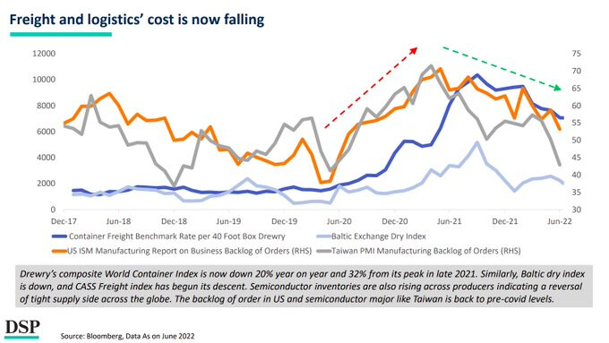
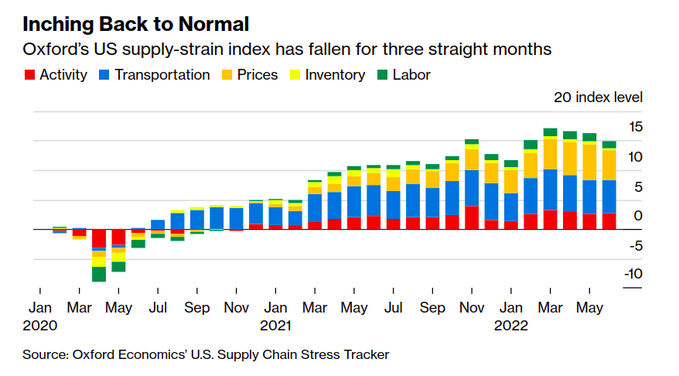
In some good news, shipping prices are significantly down from their highs. Supply chain stress also seems to be abating slowly.
Source: DSP, Bloomberg
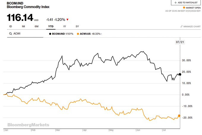
Commodity prices have significantly moderated.
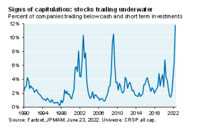
Percentage of US companies trading below cash.
Source: J.P. Morgan
Macro is all that matters.
Source: Blackrock
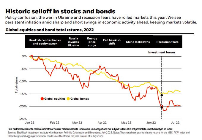
It’s been a horrendous year with nowhere to hide.
Source: Blackrock
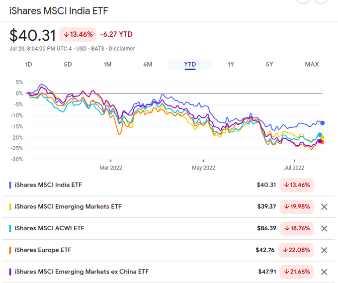
Global markets performance ($).
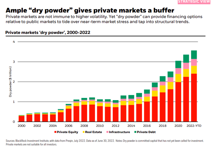
Global private equity (PE) dry powder is at over $3 trillion.
Source: Blackrock