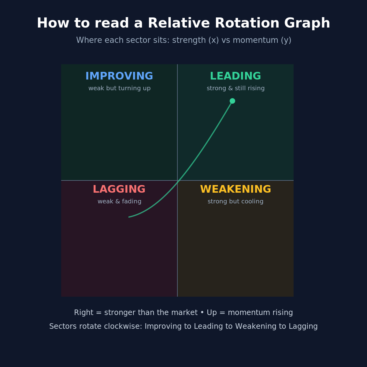
An RRG looks intimidating but is simple once you know what the two axes mean.
-
Horizontal axis = relative strength: how a sector (or stock) is doing versus the broader market. Right = stronger than the market, left = weaker.
-
- Vertical axis = momentum: whether that relative strength is picking up or fading. Up = improving, down = slowing.
Put them together and you get four quadrants:
- Vertical axis = momentum: whether that relative strength is picking up or fading. Up = improving, down = slowing.
-
Leading (top-right): strong and still gaining - today’s outperformers.
-
- Weakening (bottom-right): still strong, but momentum cooling - often the next to fade.
-
- Lagging (bottom-left): weak and still losing ground.
-
- Improving (top-left): weak, but momentum turning up - often the next to recover.
The useful part is the rotation. Sectors tend to travel clockwise over time: Improving to Leading to Weakening to Lagging and back. So it is not just a snapshot of who is winning today; it hints at where money may be rotating next.
- Improving (top-left): weak, but momentum turning up - often the next to recover.
Two things people get wrong:
- It is relative, not absolute. A sector in Leading can still fall if the whole market falls - it is just falling less than others.
-
- One reading means little. What matters is the direction of travel (the tail), not a single dot.
A simple version of the four quadrants is attached. How do others here use RRG - as a top-down sector filter, or more for timing entries?
- One reading means little. What matters is the direction of travel (the tail), not a single dot.