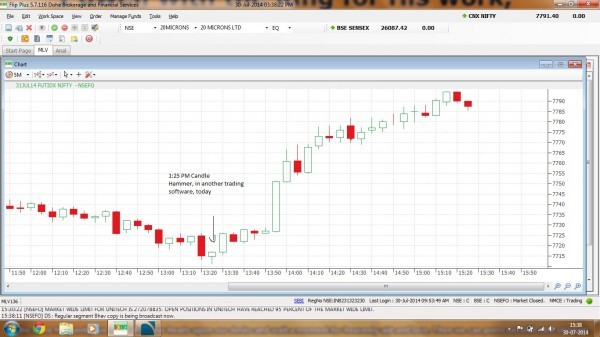
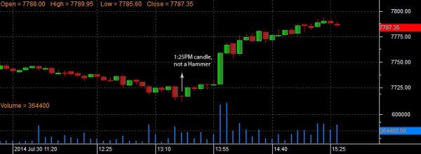
While analyzing todays Nifty's 5 min Candle chart, i compared zerodha's software and DBFS (old software), there is a difference in the chart ending and beginning, actually it's a hammer which is not shown in the candle chart of zerodha's, why is this happening?
let me know if i'm wrong!