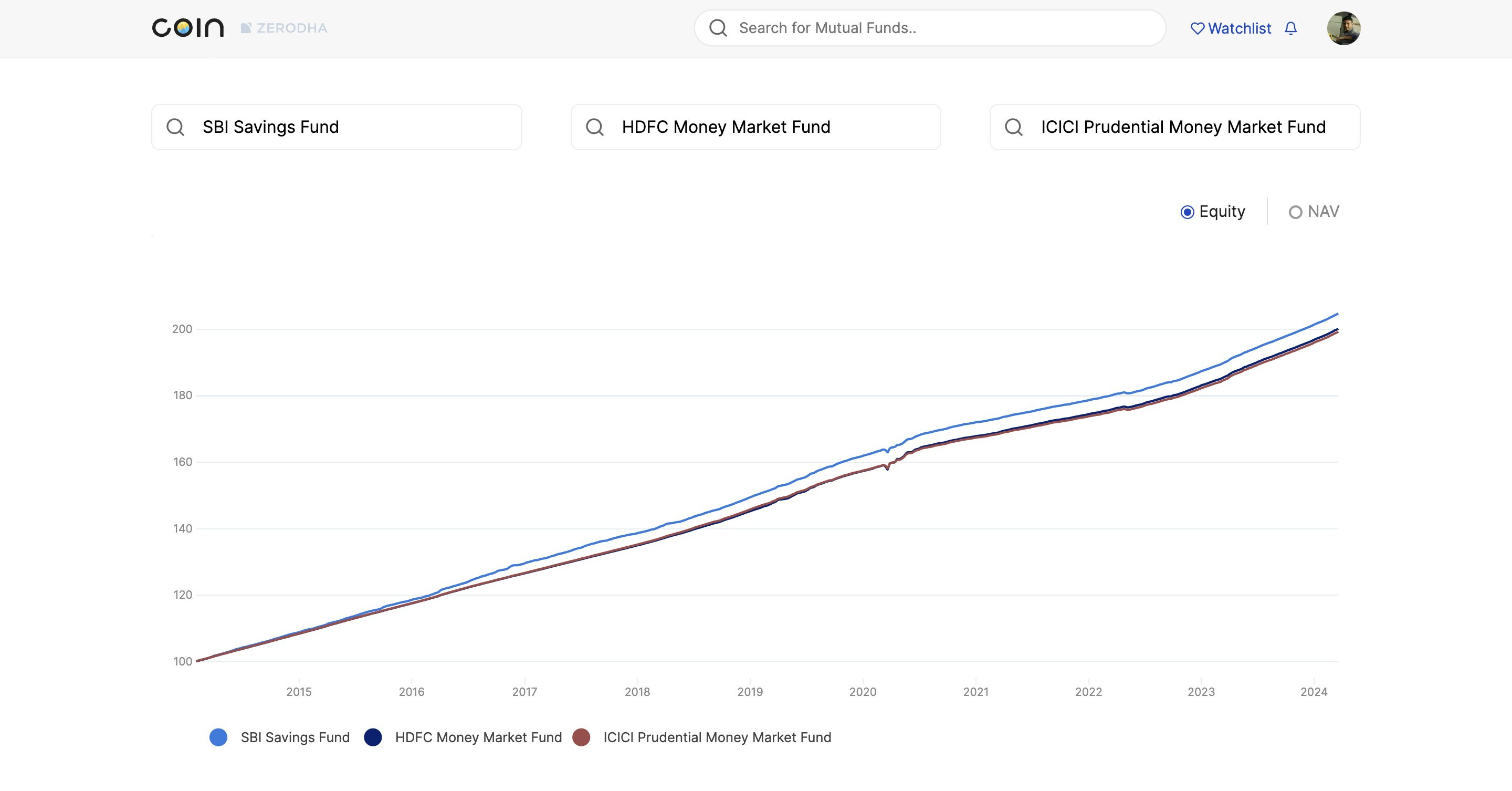
The graph shows that SBI has outperformed the other two.
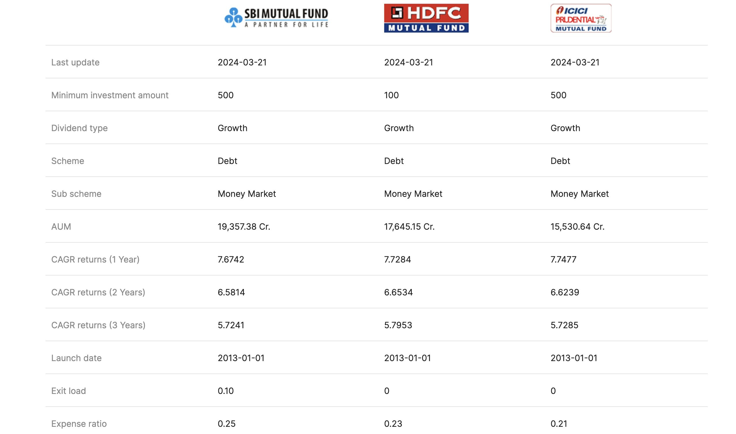
But, the CAGR of SBI is the lowest (for 1, 2, & 3 years)
SBI has a higher expense ratio and exit load.
What am I missing?
The graph shows that SBI has outperformed the other two.
But, the CAGR of SBI is the lowest (for 1, 2, & 3 years)
SBI has a higher expense ratio and exit load.
What am I missing?
I have seen the same issue a couple of times while comparing funds further