Is this a professional answer ? Is this acceptable in corporate ?
kIndly check for the viability and don’t wait for PILE OF COMPLAIN only to wake up ?
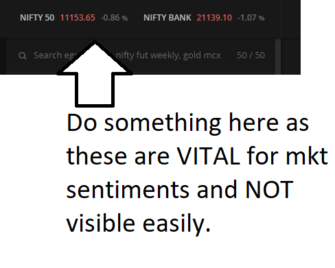
If such is going to be the response then I am sorry I may need to reconsider my broker as this is absolutely not professional and i am pretty disappointed …
I will reiterate this. You need to get some graphics designer on board and get the colour issue sorted out.
It feels straining on the eyes.
You can use fyers web platform’s dark theme for reference.
Bluish hue color rather than current reddish.
Change of font and increase zize by at least 0.25 pts.
I have a decade of percipience in Technology and in that context i send feedback. My bad too … I thought this is a SERIOUS platform to collaborate and enhance the kite framework.
There is something called Usability Testing.
Usability Testing also known as User Experience(UX) Testing. i would urge to let this feedback pass through them.
Kindly if possible , TEST and change appropriately.
They need to address this with a preference setting instead of you asking them to change directly.
UI should be customizable by user like in TradingView for example.
Colours / font size atleast to start with.
Fonts / colours / sharpness etc varies greatly based on the screen and also a certain degree to an individuals eyes.
So currently, the entire layout and colour scheme is perfectly fine for me.