You Mean in TFC ?
Can take a month more.
1 Like
No, option to add what ever widget user wants to see, like market watch, option chain, charts, positions etc as their frontend.
4 Likes
1 Like
@Champion_Trader I guess some of your browser extensions are causing this. Can you try it on incognito without any extension? Maybe chrome/firefox.
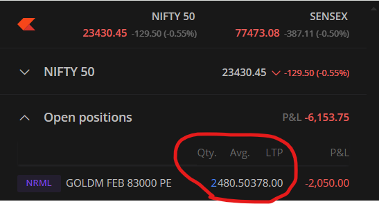
Please check how it supposed to look.

1 Like
I got it, it is happening when zoom is more than 125%.
1 Like
yes, right
I want to highlight a few more issues:
- The basket doesn’t sync between the Kite main page and the pop-out chart page. To sync, we need to refresh the entire page.
- The chart pop-out button opens the old pop-out page. (only the option chain pop-out opens a newly updated page.)

Aware of this, we are investigating this for the possibilities.
Yes, we do not kill the pop-out chart for now. The option chain popout will be different.
1 Like
Can u add open interest feature on web & app trading view chart that will be more helpful with analyzing chart on both
After 3-4 months.
1 Like

Thank you for promptly addressing the reported issues. The fixes for options identification in the dark theme and pin alignment have greatly improved the user experience. Your prompt attention and commitment are greatly appreciated.
2 Likes
That is on our to-do list; however, it is a separate feature that cannot be combined with this.
I recently compared the old and new option chains and noticed several areas where the new version could be improved:
- Color of Options: Is it possible to change the color of the options to a default theme , similar to the old option chain? This would enhance visual consistency and readability.
- OI Bar Color: Can the color of the OI bar be changed to a darker shade to improve readability against a white background? In the default theme, it is currently challenging to understand due to the white background.
- Column Color Consistency: The OI bar goes through two columns, and both columns have different colors. If both columns could have the same color, similar to the old option chain, it would provide a clearer and more organized view.

I believe these changes will greatly enhance the overall functionality and user experience of the option chain.
1 Like
Thanks, passed this to our team as feedback to evaluate.
1 Like
@siva @Arockiya_Raja
I am writing to bring to your attention an issue I have noticed in the new option chain data. Specifically, there appears to be a discrepancy regarding the open interest (OI) at the 23000 strike price. The bar graph does not seem to align with the reported OI values.


Could you please look into this matter and provide clarification
On the new option chain, the bar graph length is decided based on the highest OI of call or put strikes. whereas previous widget bars are based on combined strikes of the expiry. I will check this. Thank you.
I found that OI Bar is similar to Dhan, but there are some differences when compared with Sensibull and Groww.
Thanks for your additional information.
1 Like
- if possible, bring absolute mode choice on option chain for LTP change wherein user can view absolute change or % change in LTP as per his choice.
- Kindly bring more bright colours on the option as the backgroup and font colour seems too dull.
- whether the quantity and other inputs are editable in the baset window once we add multiple legs in basket mode?