Introducing the Native Option Chain on Kite Web (Beta)

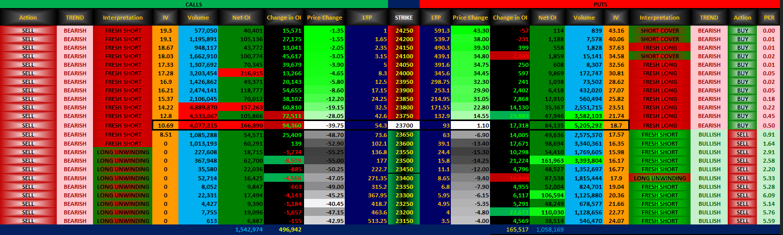
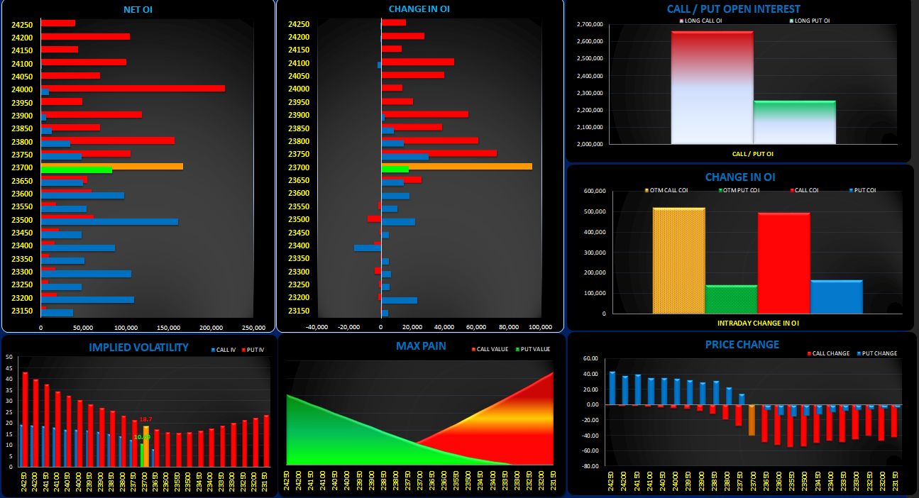
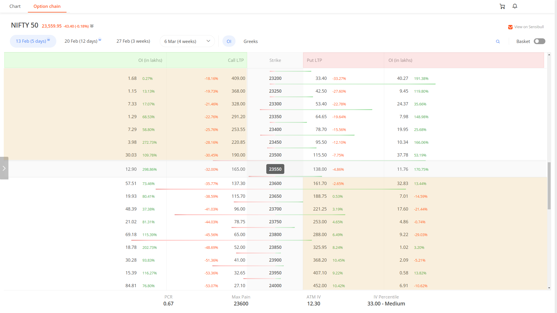
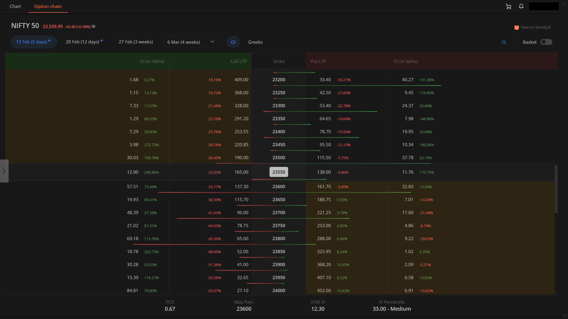
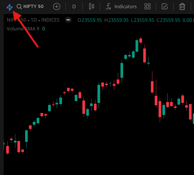
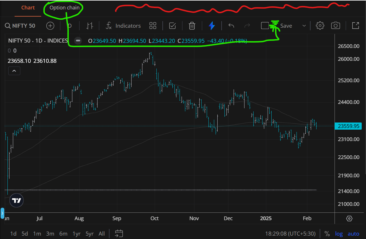
We’ve been working on offering a native option chain right within Kite for quite some time now, and we’re glad to say this project is near completion. We now need your help in ironing out the final version. The beta option chain is currently live on https://kite-beta.zerodha.com. You can access it the same way you access option chain on Kite today, with the button on the context menu or the option chain tab on the charts.

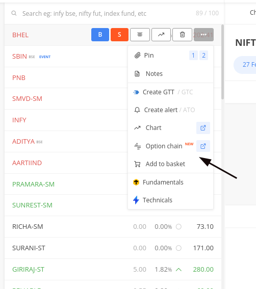
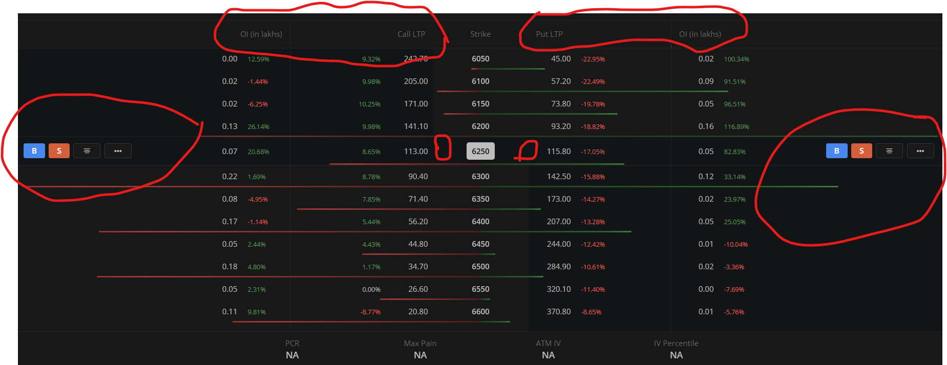
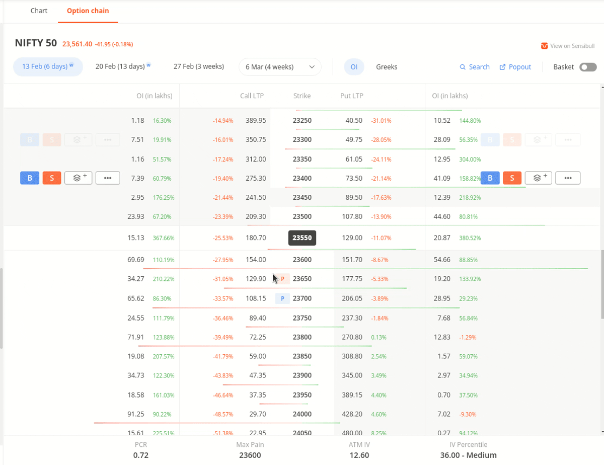
By hovering over a strike, traders can quickly access Buy, Sell, and Add to Marketwatch buttons, while the context menu offers additional options to open charts, create alerts or GTT, and check market depth.

Please try it out and share anything you think we need to make better.
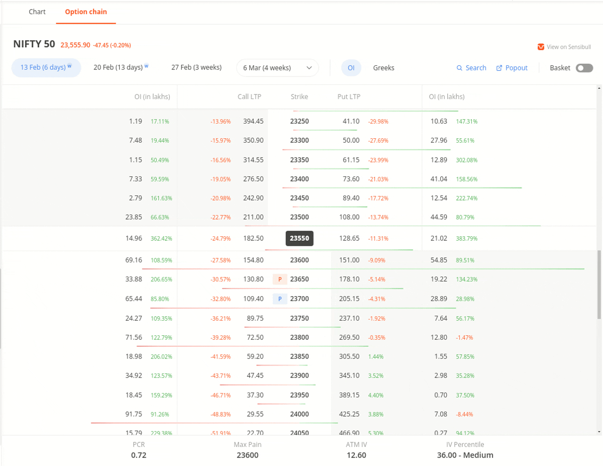

Key Features:

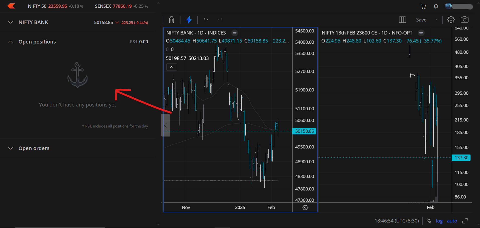
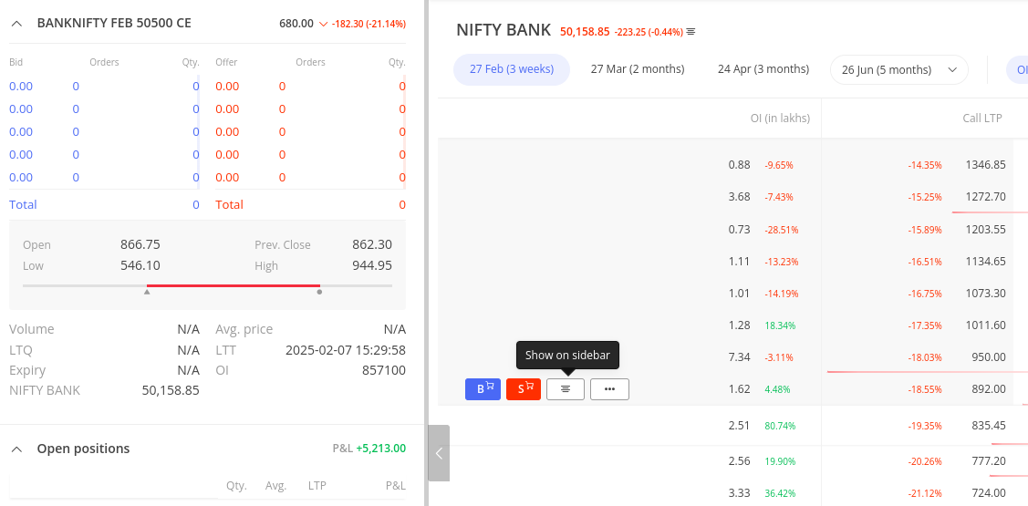
Open Positions on the Option Chain
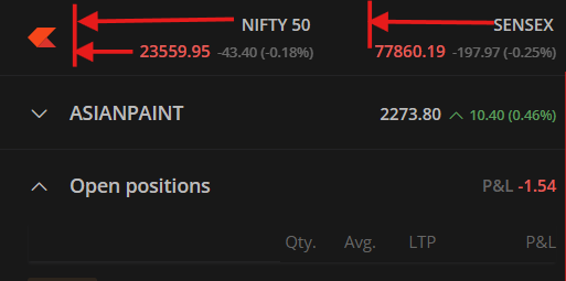
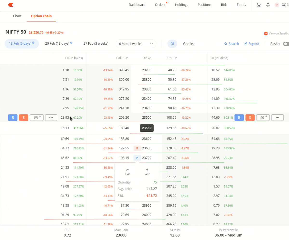
See your open positions directly on the option chain. Long positions are highlighted in blue P tag, and short positions in orange P tag. Clicking on a position shows you the quantity, average price, P&L, and quick action buttons to exit or add positions.

Easy basket creation

Switch to Basket mode and add all the contracts you want to trade at once right from the option chain.

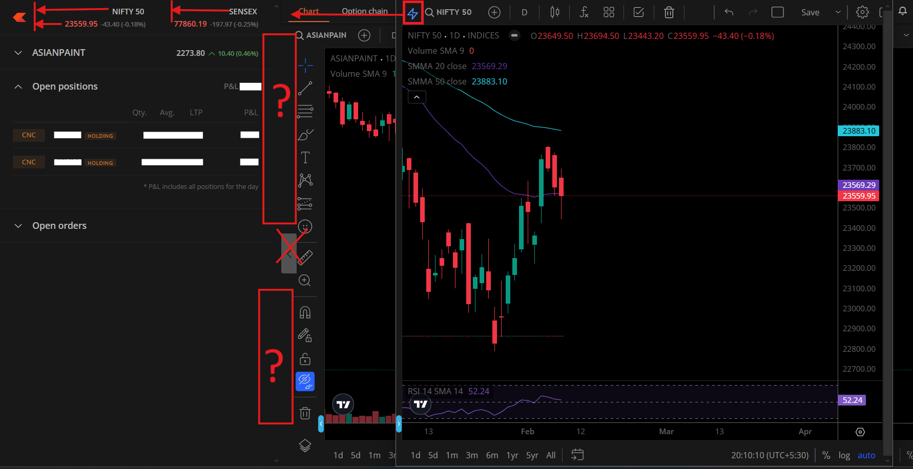
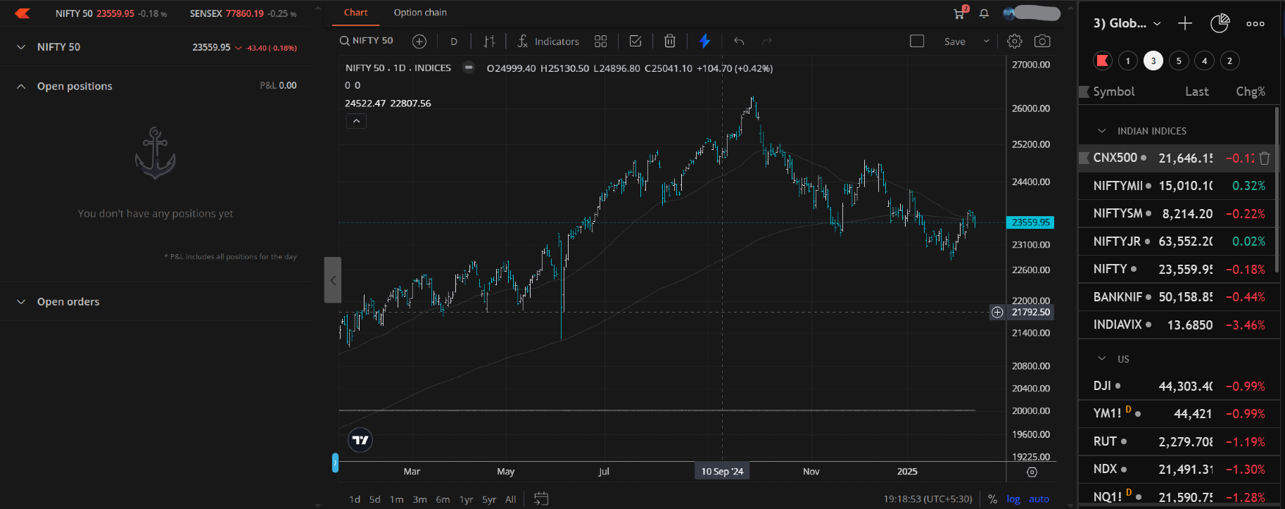
Full-screen Option Chain

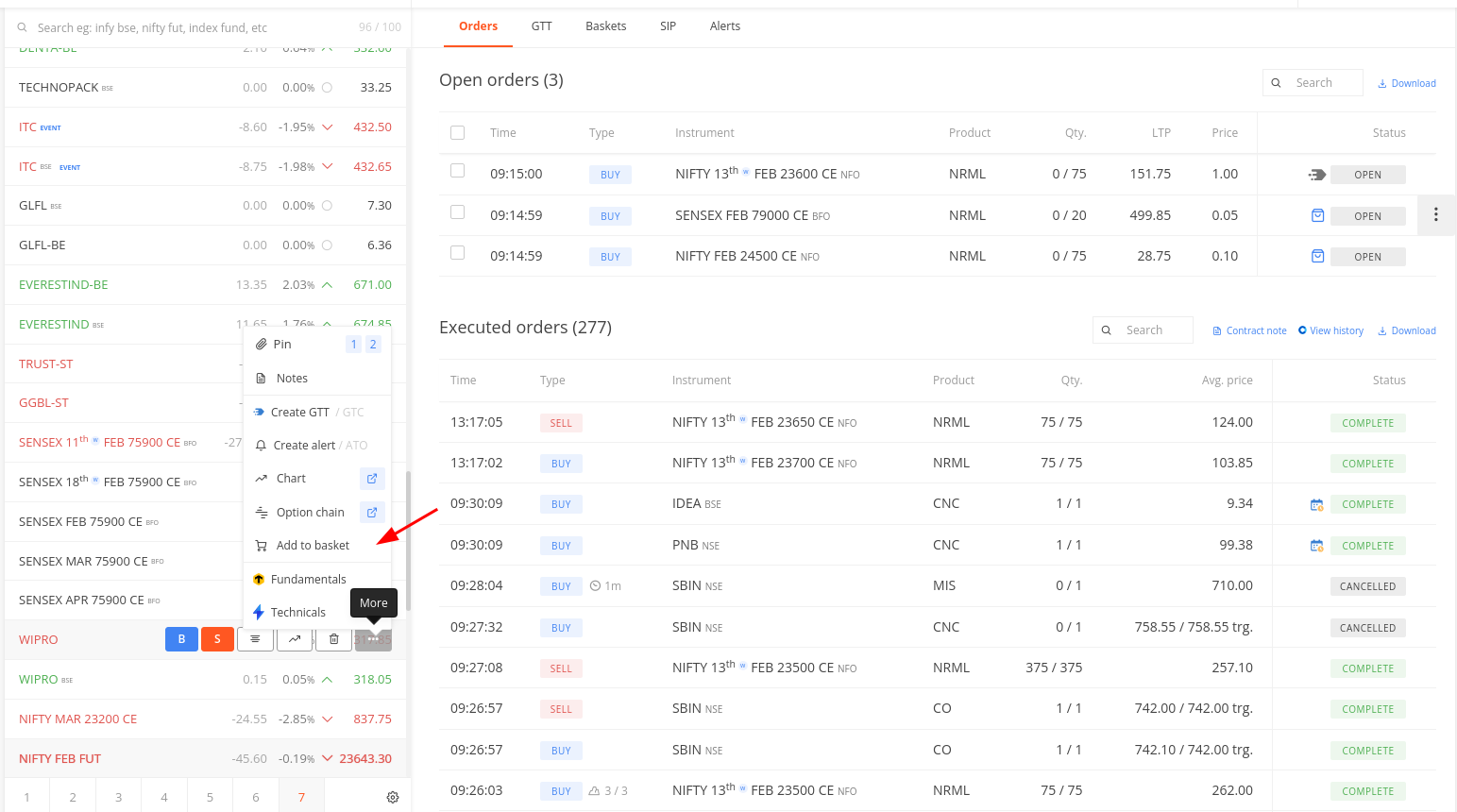
You can pop out the option chain to a separate window. This view also allows you to still view the marketdepth of individual contracts, your open positions, and orderbook in the side panel.

  • The market depth is hidden by default but can be expanded when needed.
  • You can view open positions and open orders while simultaneously analysing the option chain, ensuring better decision-making without switching screens.
  • A search option is available, allowing traders to switch to another instrument and place trades seamlessly.
  • You can collapse or expand the side panel as needed.

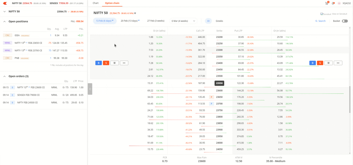
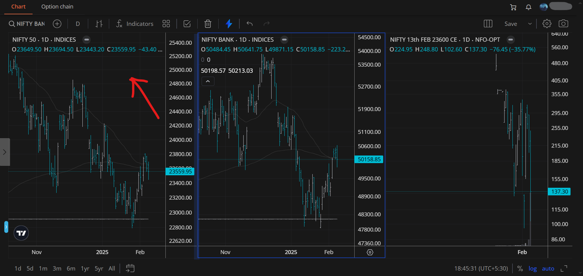
Chart Tab Next to the Option Chain
A dedicated chart tab allows you to switch between the option chain and charts with a single click. Charts can also be opened directly from the option chain without adding instruments to the marketwatch.

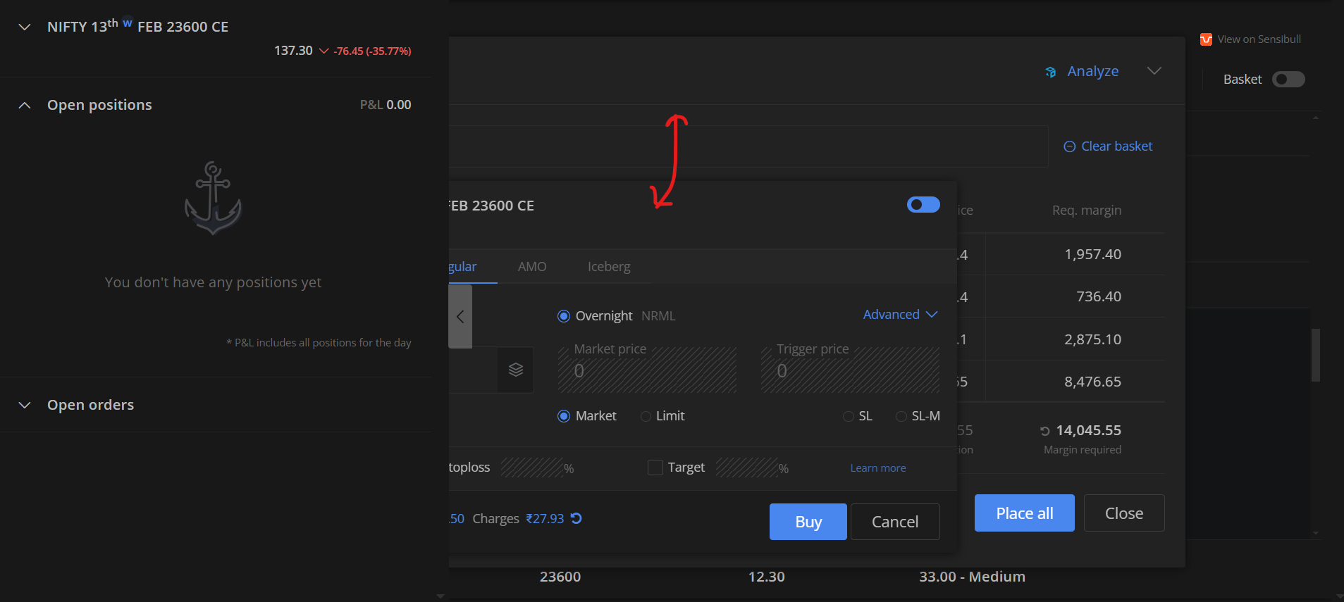
Add orders to baskets from anywhere
You no longer have to open the basket order window, search fro the instrument, and then add it to a basket order. You can now add orders to the basket from the marketwatch, orders, positions, and holdings screens directly.


Additional Notes:

  • Greeks and certain bottom panel data points are currently unavailable for MCX but will be added soon.
  • As this is the beta platform and not the primary instance of Kite, some features may not work as expected, especially if there is an external service like fund addition, Sensibull, etc., is involved in the flow.
  • Settings stored locally on kite.zerodha.com, such as chart drawings, pinned stocks, and marketwatch preferences, will not sync with this version but will remain intact when logging into Kite.

:loudspeaker: Check it out on kite-beta.zerodha.com and share your feedback!

21 Likes

Can we select multiple strikes at once and add to marketwatch?

Add a lot multiplier in the basket mode.

1 Like

Thanks a lot Team Zerodha, @Arockiya_Raja and @nithin for bringing this feature on kite after years of my request. Although, its in beta and much primitive, however ok as first step. A few points to improve further:
1- Buy/Sell panel currently are at extreme ends of screen. Pls bring closer near to strike price column.
2- Option to have Strike Prices upside down or vice versa.
3- Only LTP and OI available currently and Greeks . Pls provide option to select more parameters as per individual choice.
4- Option to select no of strike prices (5, 10 or 15 etc)
5- Bring the UI closer to my uploaded image if feasible.
6- Color differentiation between OTM Call/ Put. Currently, it is hardly visible.
7- Graphs missing.
8- OI graph bar not as per OI data.

Thx a lot Team.

You can add directly to MarketWatch rather than selecting and then adding, but entire expiry strikes cannot be added in one click.

1 Like

Feedback noted.

Currently, our focus is on delivering the native option chain. For a comprehensive options trading experience, we recommend using Sensibull.

1 Like

While some people may like looking at all the greeks and other data, I don’t. It would be nice if there was a toggle button at the top that switches between a “minimal” view and an “advance” view. The minimal view would also make it more usable in a mobile web browser or in a windows with less width, and since it uses less data, it might be easier on your backend as well.

Font and typefaces could be better, for this as well as the rest of zerodha ui. I am not an expert but the website doesn’t utilise the full value of fontsize, boldness and monospace fonts. More frequently seen values should be bigger, important things should be bold and numeric values can use a different font,perhaps one with a fixed width. Even Trebuchet MS would be better than the current Open Sans.

Also, numeric values in a column should be aligned by the decimal point, i.e., all decimals should be in a straight vertical line regardless of how many digits are on either side.

I wanted to share some suggestions to enhance the user experience on the platform, particularly concerning the dark theme option chain:

  1. Identification:
  • Users currently find it challenging to quickly identify options in the dark theme.
  • Adding specific color codes for At-The-Money (ATM) and Out-Of-The-Money (OTM) options, similar to the old option chain or Sensibull option chain, would greatly enhance the user experience.


  1. Option Chain Alignment and Buttons:
  • Pin Alignment: Adjust the alignment of pins to the left to create a cleaner and more organized appearance.
  • Hide/Unhide Button: Modify the hide/unhide button to be similar to the popout chart button, reducing unnecessary space consumption and increasing the size of the Chartan/option chain.

I believe these improvements would significantly enhance the user experience. Thank you for considering these suggestions

We will see if we can do something on this.

Didn’t understood what should be changed here, can you be more detail, please.

Pin Alignment:
Current Issue: The current alignment of pins might be misaligned.

Proposed Solution: Align the pins to the left to create a cleaner and more organized appearance.
pin alignment

Hide/Unhide Button (personal opinion):
Current Issue: The current button doesn’t look good.

Proposed Solution: Modify the hide/unhide button to be similar to the popout chart button, which is more attractive and efficient.

I believe that implementing these improvements would significantly enhance the user experience. These changes are less important, but if done, they would be greatly appreciated.

These changes are important, and I would greatly appreciate it if they could be considered. Thank you for considering these suggestions.

Are you checking on mobile browser?

Yeah, this is noted.

No, on laptop

@siva
I just checked it out and found it good and easily accessible :smiley:

I have a few queries and suggestions:

  1. How can we create multiple baskets like in the older version?
    (e.g., Basket1 for investment picks, Basket2 for option strategies, etc.)

  2. It would be more useful as a draft order if there were a separate execute button. Currently, I only see the “PLACE ALL” button in the basket.

Overall, I like the new basket design as it is very easy to access. It would be great if we could create and view multiple baskets and have a separate execute button.

Right now, it can only be used as a temporary basket. For example, if I want to execute an options strategy, I can quickly add 3-5 legs to the basket and execute it, then clear the basket and add new legs for another strategy. However, it doesn’t fully replace the old basket system. I hope you got my point.

Along with this, I have a few more suggestions:

  1. The placement of the option chain name creates unused space, reducing the chart area. If possible, can the option chain icon be placed as shown below?

  2. Can we have an option to edit the columns of the option chain?

  3. Currently, to view market depth in the option chain, we either need to add the instrument to the watchlist or click on the three dots to open a pop-up. Instead, can we have the market depth functionality similar to the watchlist? (Where opening market depth pushes the next strikes five rows down and displays five levels of depth.)

  4. In Pop out charts, The basket order pop-up and order window currently go behind the sidebar. Can they be brought to the front?

  5. It would be great if we could access the watchlist directly from the sidebar.

  6. In pop-out charts, the sidebar hides the charts on the left when using a multiple-chart layout. I would prefer the old style, where the sidebar pushes the entire chart window to the right.

  1. This one is not related to the recent update. On charts, symbols that don’t have volume data still display a line, which is a bit distracting. Is it possible to hide the volume entirely for symbols that don’t have volume data?

Thank you :slightly_smiling_face:

2 Likes

In coming days will give option to create new there itself, currently you have to go to orders-baskets and then create new.

You can select what ever you want and place those legs only.

We will replace old in coming weeks and give create new option here itself.

How do you switch between chart and option chain then?

Not possible.

Try popout option chain, this solves many requirements, no need to go any other tab for option trader. For depth click sidebar as below.

Guess it has to do with your system zoom level, can make it normal.

Means?

@Arockiya_Raja Can we get this checked?

May not be possible but will get this checked.

1 Like

Thanks for the detailed reply @siva

ok :slightly_smiling_face: :+1:

Ah, yes, got it. Sorry, I didn’t notice it at first :smiling_face_with_tear:

Okay, so basically, what I imagined is having an option chain button similar to what I showed in the picture above. When we click on it, the option chain would open in a pop-up.

The main benefit of this is that we can select strike prices for our strategy while looking at the charts. Currently, we can either view the chart or the option chain, but not both at the same time. As a technical trader, I usually analyze charts first before selecting a strike price, so having both the chart and option chain visible simultaneously would be much more useful.

Yes, I tried it, but the sidebar overlap issue is still there, along with the chart pop-out.


I tried this, and the issue occurs only at certain zoom levels.

Something like this.

When my browser is not in full screen, I encounter the such issue. However, when I switch to full screen , the issue no longer.

1 Like

I’m experiencing this issue at my default zoom level and above, but when I zoom out slightly, it works fine.

1 Like

@Arockiya_Raja , In Fyers a scalpers terminal has been provided similar to that kind of option chain provided with chart will be very useful to Trade. Kindly consider this as a request.

1 Like

@Arockiya_Raja , Please provide option chain option beside the chart like other brokers, Currently we have to switch between chart and option chain separately, if we are in option chain and if any big move happens then it will be difficult.

Yeah, will bring out terminal mode soon.

1 Like