Hi @nithin,
I have a feature request in Kite/Coin -
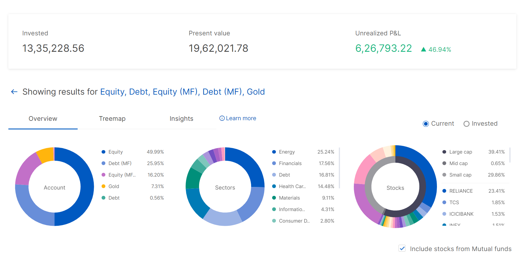
Having been invested in the stock market, I can have a look at my reports from the console. But one thing which I find missing is a visual representation of my investments like a line chart. There is a pie chart breaking down my investments into different market caps but not a graph.
One can look at any company’s graph but there is no way of visualizing our portfolio in a graph. The columns in holding shows net change and 1 day change but it doesn’t give a whole picture. Also at the bottom one can see Day’s PL and Net PL.
I’m hoping this to be a useful feature for every investors like me.
Regards.