Please fix this.
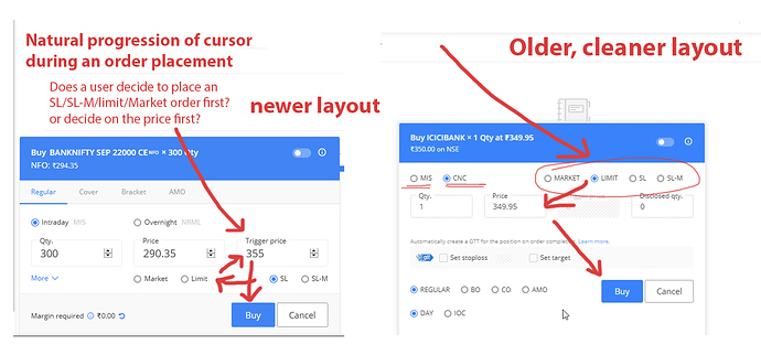
And if you want to move that window it’s little bit laggy and not able to move where ever we want. There are some some bugs related to that order window.
I think they should remove that window to some other location which won’t be in the way of indicators. We are not able to look at the other indicators because of the order window they should fix that window some where on the right side which is some what similar to trading view website.
