let the beta improves over times. i am telling you what i/we need as i have mentioned earlier in other thread.
why there are still no analyze button on quick basket?
why no clear basket button in actual basket section where we create basket?
it should be easy to change strike price in the basket, example if i add wrong script i have to search again in the main basket or go through option chain for adding in quick basket.
if i change layout from single to multiple even the crosshair enabled setting still not showing buy sell button on inactive layout. only action layout got buy/sell button.
we have to click chart widget first then in option chain scripts to view chart, if any other widget is active, it won’t show the chart,
sensibull widget will be a great addons, we can see straddle chart with vwap or any other data whatever people prefer.
Your feedback has been noted. We will discuss this.
In multiple charts, there is a corner case where the order window is invoked incorrectly. We will review this in the new version.
I believe you’re referring to the Terminal Mode feature. This behaviour is expected. Since multiple charts can be added, the user needs to keep the required chart active.
Some of the most-used Sensibull features will be added as widgets soon for easier access.
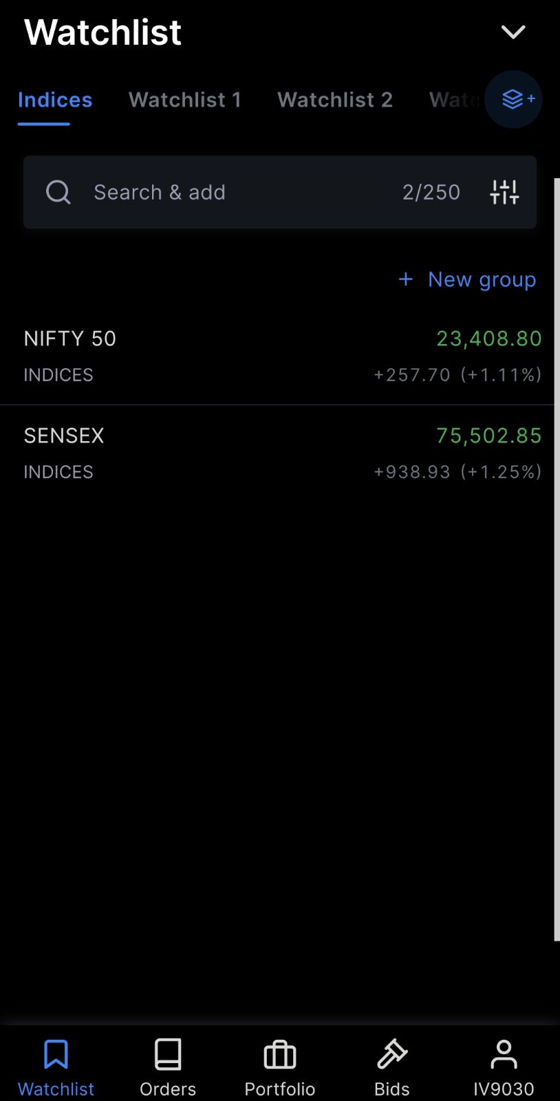
Hi @Arockiya_Raja, currently in the marketwatch section, if we type Banknifty or finnifty, we don’t get index instruments. We need to type Nifty Bank or Nifty Fin service, the exact name to get indices.
Why don’t we get indices matching ? Typing the exact name will not be possible all the times. Like if I type Banknifty, we are getting f&o contracts, similarly I should get index also in the search results.
Same issue with Nifty also, I need to type Nifty 50 to add the index. If I just type Nifty it won’t give me index result.
Secondly, I got the marketwatch group update today in the app. In that I can see some pre defined watchlists grouped by sectors. Various colours are tagged to different sectors. Rather than this, if you tag green colour and red colour automatically based on the sector performance during the day comparing previous close, it will be useful to see in a glance which sectors are doing good today and which are not, mostly like a heatmap.
The new marketwatch in Kite mobile app is so disappointing…the UI is not so sleek anymore.
The app is gradually becoming so slow to use. Moving from one watchlist to another refreshes everytime. Plus the infinite scroll is very irritating. To be honest, nobody uses so many watchlists. The whiteline near the right side of the app indicating to scroll is damn ugly. Please revert back to old version or give an option to switch off the new marketwatch just like disable option for chart quick launcher. @Arockiya_Raja@nithin