Thanks for the independent cross-verification.
Even i started with the same basic premise (unbiased 50-50 red-green outcome)
and later extended it to handle biased probabilities
(once i observed that the last 12 years of NIFTY50 has ~45% red weekly candles, not 50%).
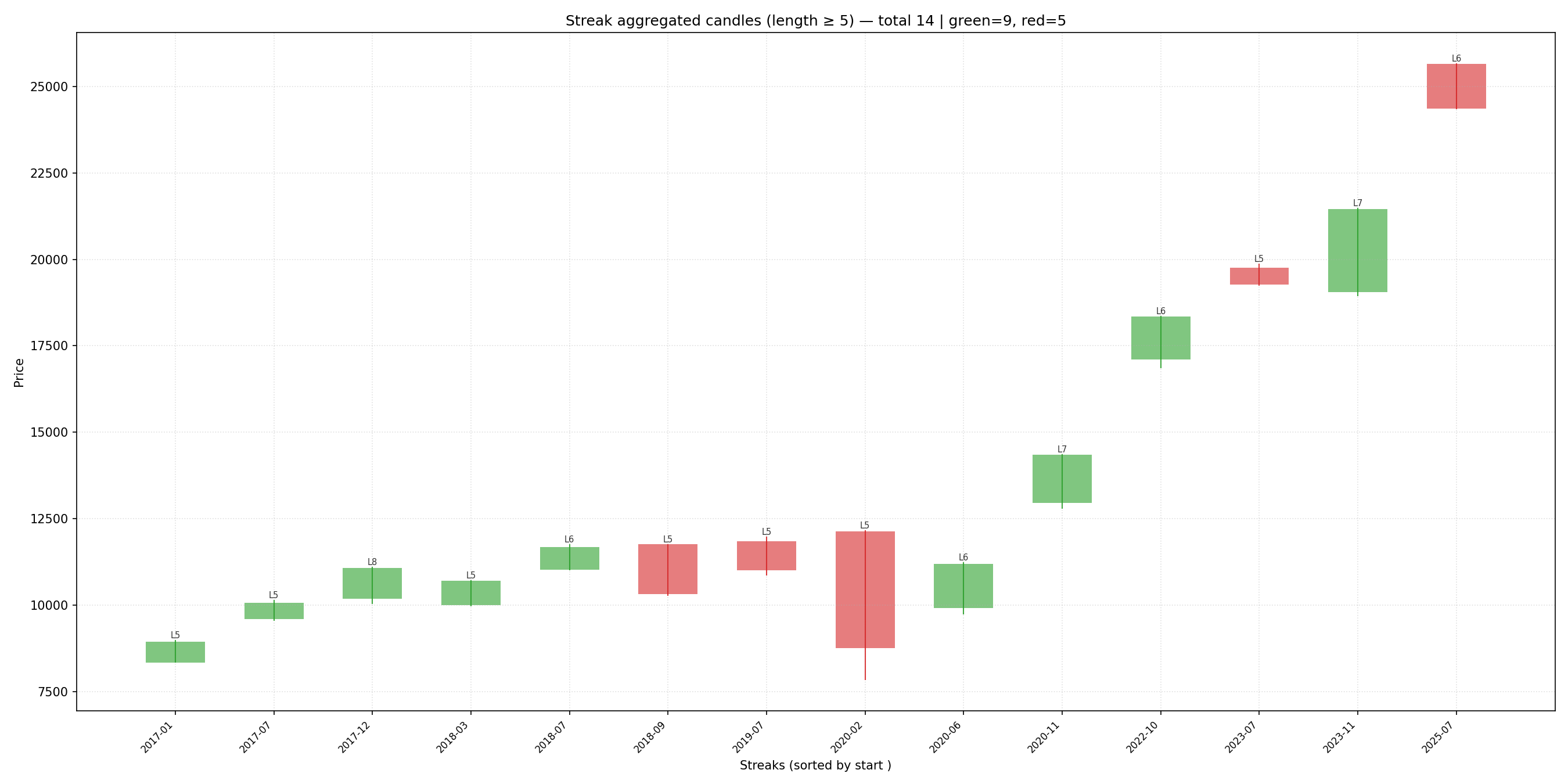
Summary of weekly streaks 5 or longer (~2013-2025)
 "selected_rows": 600,
  "red_candles": 271,
  "green_candles": 329,
  "streaks": {
    "red": {
      "1": 88,
      "2": 39,
      "3": 17,
      "4": 7,
      "5": 4,
      "6": 1
    },
    "green": {
      "1": 68,
      "2": 47,
      "3": 20,
      "4": 13,
      "5": 3,
      "6": 3,
      "7": 2,
      "8": 1
    }
  },
  "red_ratio": 0.45,
  "green_ratio": 0.55,
Inspired by the link to forecasting volatility in this comment,
another aspect that i spent quite some time on, was how these streaks/runs can correlate with volatility.
Haven’t managed to wrap my head around it yet. ![]()
The post on forecasting volatility contains this observation -
In some markets, volatility develops asymmetrically with price direction.
In stocks, volatility almost always increase much more as stocks decline than
it would for the same magnitude of a rally.
…which appears to hold good for NIFTY50 weekly stats that we have (at first sight).
Definitely requires further careful consideration of the magnitude of price movements and not just the count of streaks/runs.