HI, guys and girls at Zerodha. I am new to the forum came here just to make a suggestion for kite web.
The recent kite3 app is well designed and I like the interface. I have a few suggestions for kite web.
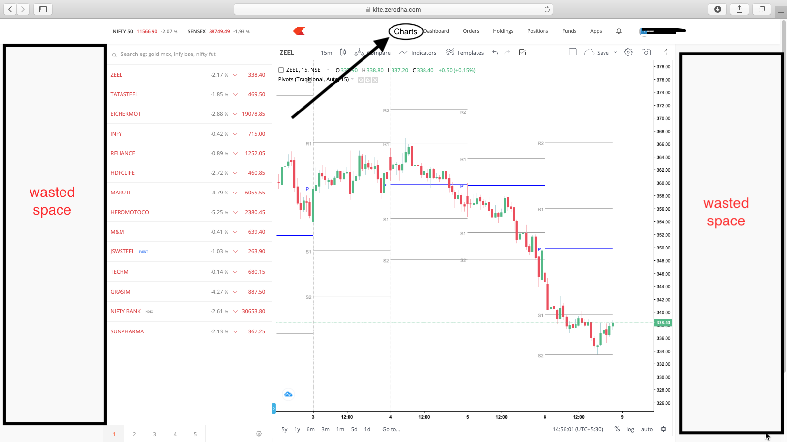
I have a big monitor when I have my watch list and charts open the platform isn’t using much of the screen space.
It would be better if the platform utilized much of the screen and also good if you allowed users to drag them like widgets.
And also whenever I switch between tabs from the dashboard, orders, positions, etc. I will have to load charts every time I come back to the dashboard. If there was a tab just for watchlists and charts which stays like that even when I switch tabs.
So since web platforms are mainstreams nowadays. There are still more things to be added to the kite web.
Check the image below for more better representation.
I also use the chart pop-out feature and it doesn’t allow me to see my watch list. Most of being just technical traders we just need a single screen with watchlist charts orders and positions in one tab maybe make it as a drag and place widget.
OHH also please bring the feature where we get to see trades in real time on the TV chart also able to modify.
Everything else is fine.
thanks, guys.