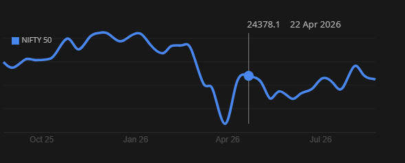
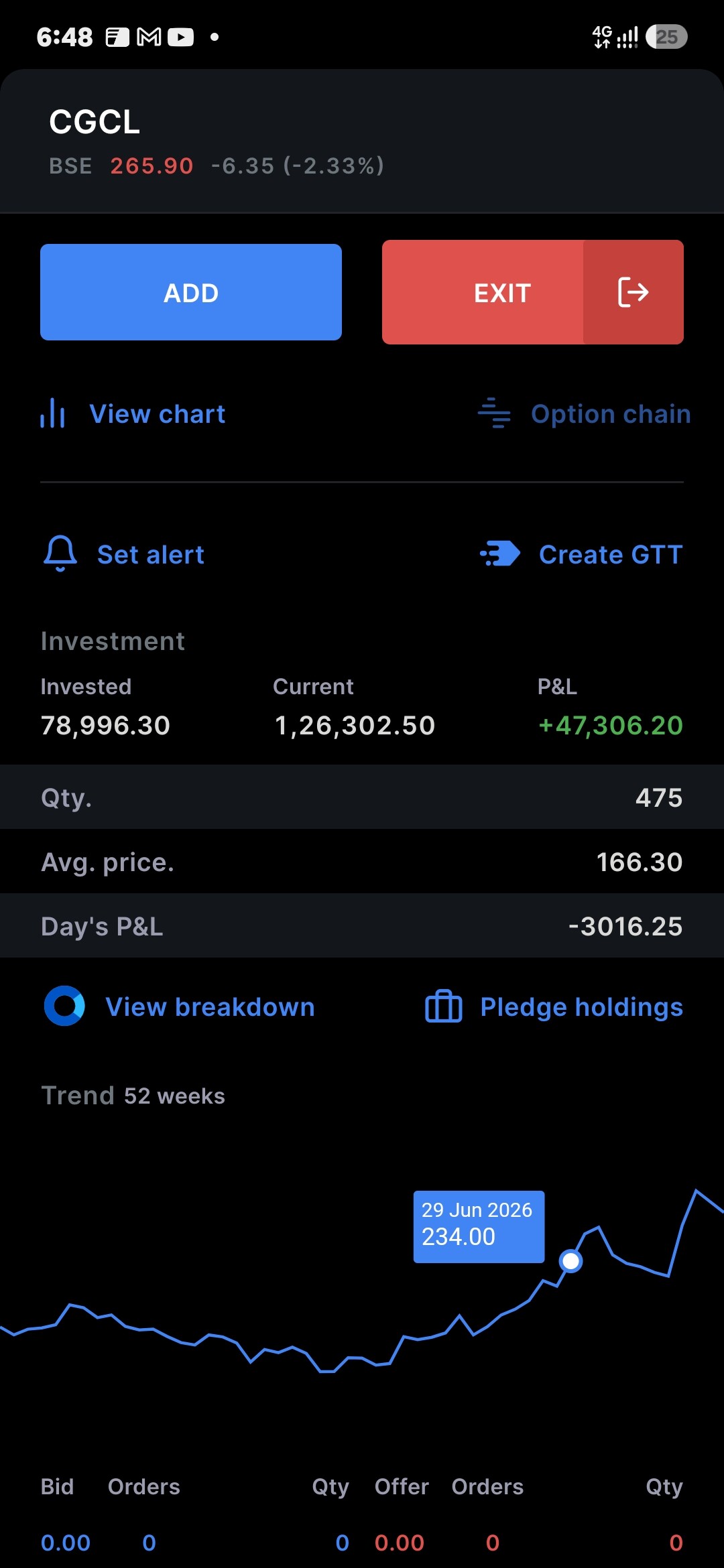
I’ve been using Kite and Coin for stocks and mutual funds, and these were actually the first apps I used when I started investing.
I really like Coin because of how simple it is. It’s very easy to understand as a beginner and I honestly love using it.
Kite on the other hand is mostly fine, but one thing I really don’t like is the charts. I understand that Kite has powerful charts and a lot of features that experienced traders probably find useful, but as a beginner, I find them a bit too much.
Especially on mobile, the charts feel laggy and cluttered. I know there are two chart options available, but I didn’t really like either of them.
I actually ended up trying a few other investing apps mainly because I wanted a better and simpler chart experience. But I still liked a lot of other things about Kite, so I kept coming back to it.
I feel like having a simple chart similar to the one in Coin would be really useful for beginners. It doesn’t have to replace the existing charts, just having it as another option would be great.
Are there any plans to add a simple Coin-like chart view to Kite for beginners?
The chart you’re referring to is already available on Kite. In TradingView, it’s called Line with Markers, while in ChartIQ, it’s called Vertex Line. Once you open a chart for a particular stock, you can select your preferred chart type, timeframe, etc., and save those preferences for future charts. You can check this support article to know how to change and save your preferred chart settings.
Kite has two charting engines ChartIQ and TradingView so you can try both and see which one works better for you.
Since you’re just getting started, if you want to get more familiar with Kite, here’s a Complete Kite tutorial . You can also check out Varsity for easy-to-follow lessons on investing and markets.
I should’ve been more specific about what I’m looking for. I’ve tried the different chart options, but they’re not quite what I had in mind.
For a quick view, I’d prefer something like the chart on Groww, upstox and other platforms, where you can see the price movement, switch between different durations, see the 52-week high/low, and hover over the chart to see the exact price.
Kite already has a smaller chart when you click on a stock, but it seems to be missing for some stocks or not always available.
Other platforms follow a similar approach. Clicking on a stock shows a simple chart where you can select durations like 1D, 1W, 1M, 3M, 6M, 1Y, and Max, and hovering over the graph shows the price. If you need more details, you can then open the full chart for more advanced features.
I think having something similar consistently available for all stocks would make it much easier to quickly check overall price movement, while keeping the existing advanced charts for people who need more detailed analysis.
And for some reason i don’t see kite’s simple charts after market closed. is it only available when market is open. I’ve attached a similar chart from kite web.