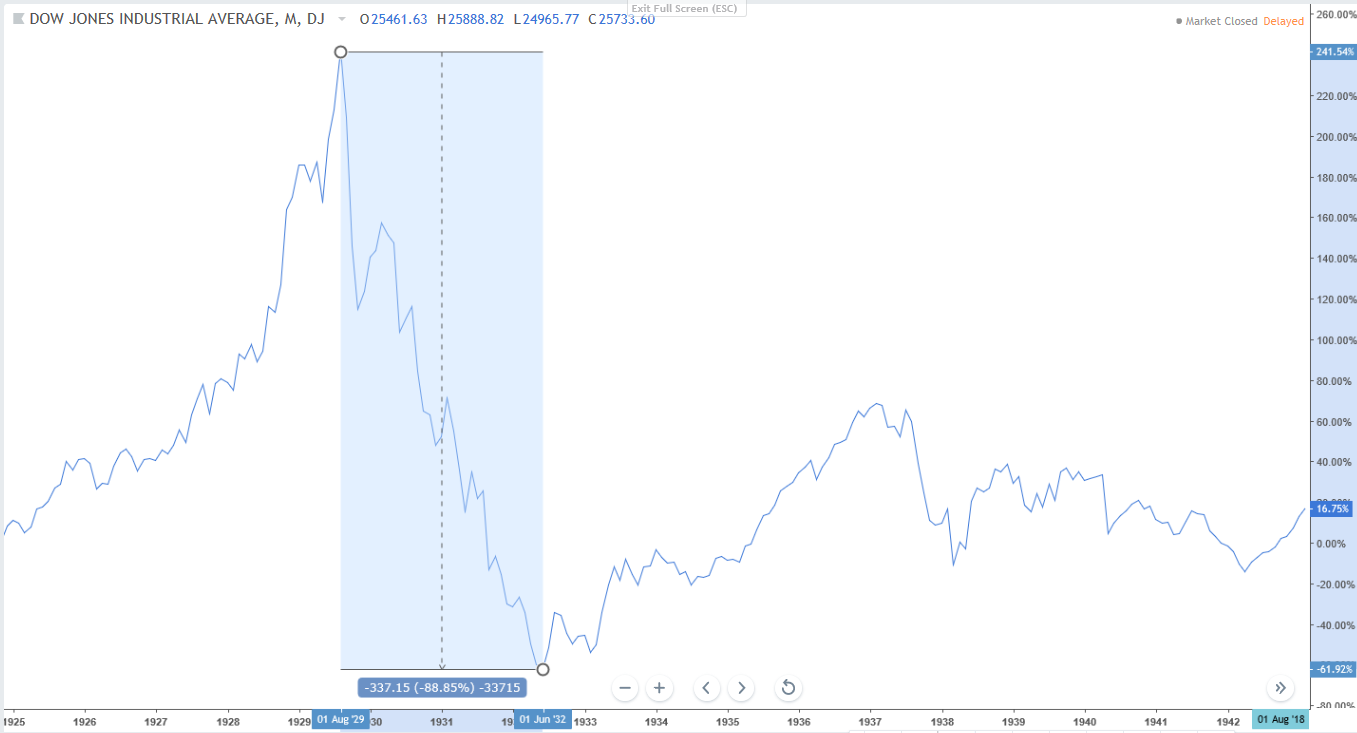
Many investors who started investing after 2010etc haven’t really seen what a market crash looks like. This is the chart of Dow Jones. From the peak in August 1929, the Dow Crashed nearly 90% over a span of 1000+ days. This was also the period which is known as the “Great Depression” one of the worst economic depressions in human history.
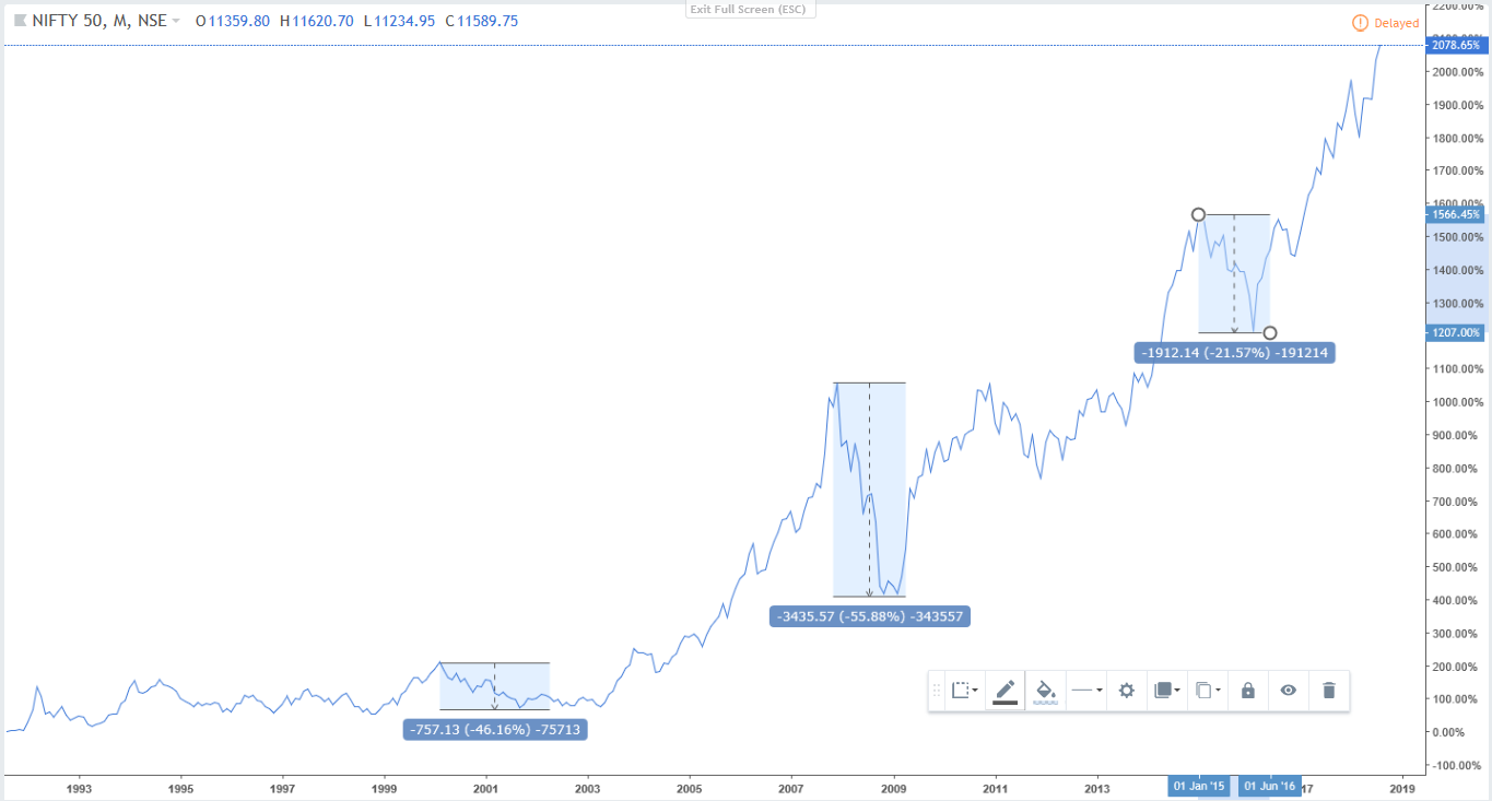
Comparatively, Nifty crashed about 40% odd during the dot com bubble and 55% during the 2008 recession. Since 2008, we haven’t really seen a crash barring a few normal corrections. If you are an investors it’s worth asking if you can stomach watching your portfolio value fall by 50% and live to wake up the next the day. Would you invest more? It is during these times that panic kicks in and the worst impulses of investors take over.
Something seems wrong with the Dow Chart atleast. I dont think you are showing cumalative returns. According to this chart people who invested at the top in 1929 never really recovered their original investment even after 90 years in 2018. That I dont think is the case.
The Great Depression was one of the worst time socially and politically. The world was suffering from finacial constraints at a time when the impacts of World War I were still clear. We all should hope that such an event never comes but with the current ecomic situation, anything is a possibility.