@nithin
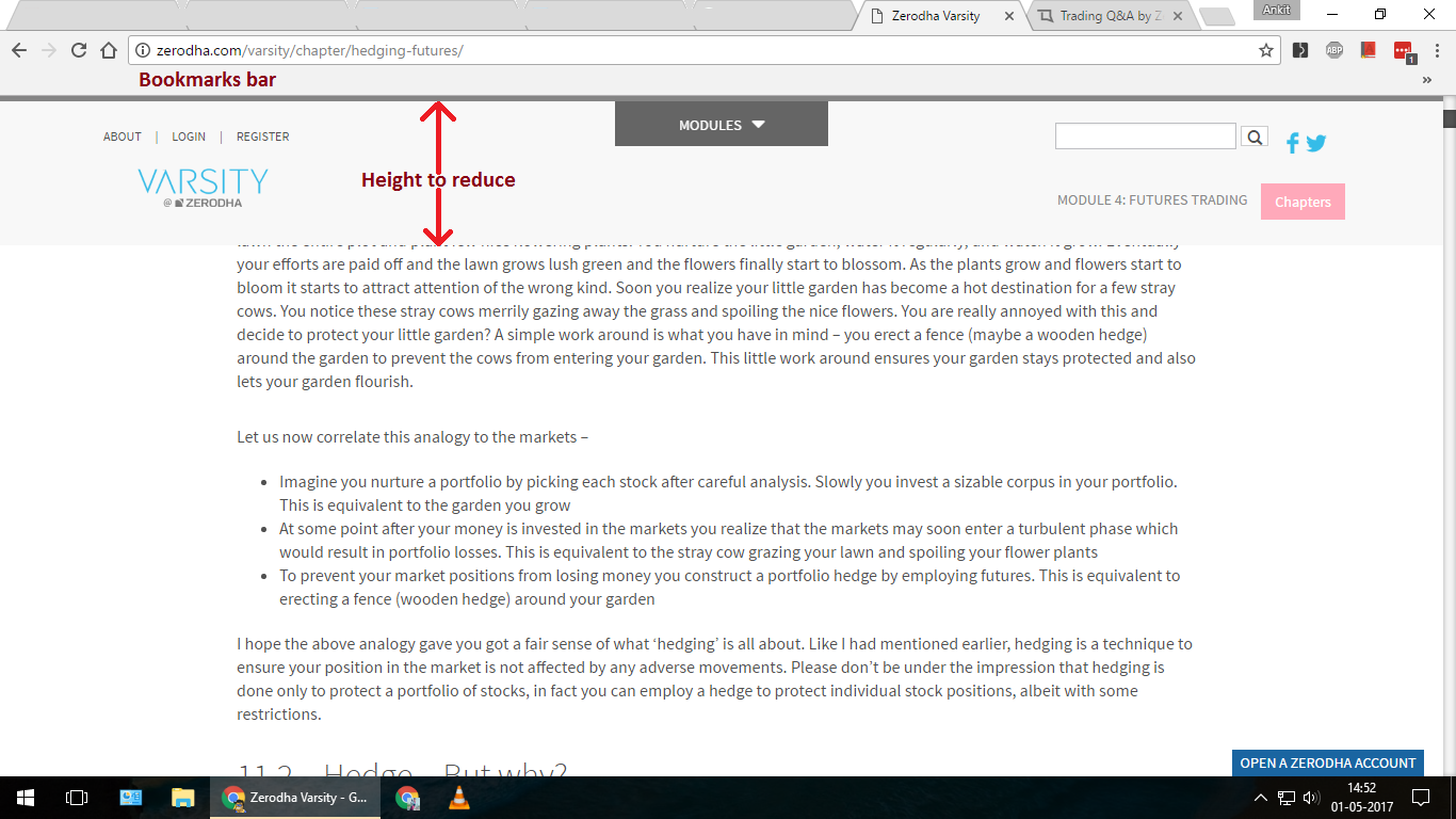
In varsity website the main header bar is having so much height that, To read text of any chapter we need to scroll down more.
The chapter page should be easily readable with less scrolling.
Kindly refer attached image.
[div class=“navbar navbar-inverse navbar-fixed-top otherheader md-navbar” role=“navigation”]
1 Like
I Second THAT thought!
It pretty annoying to have a bar hanging on top, consuming all the screen space.
Intuitive design should be like when you scroll down, the header gets hidden until you scroll back up again!
1 Like
Awaiting response @zerodha
Thanks for pointing this out, we will try and fix this sometime soon.
It is not fixed after a month.
This is a big problem on mobile. Please get this fixed ASAP.
We are working on this. Should be sorted out soon.