Yes, we have just launched continuous futures charts on Kite for Equity.
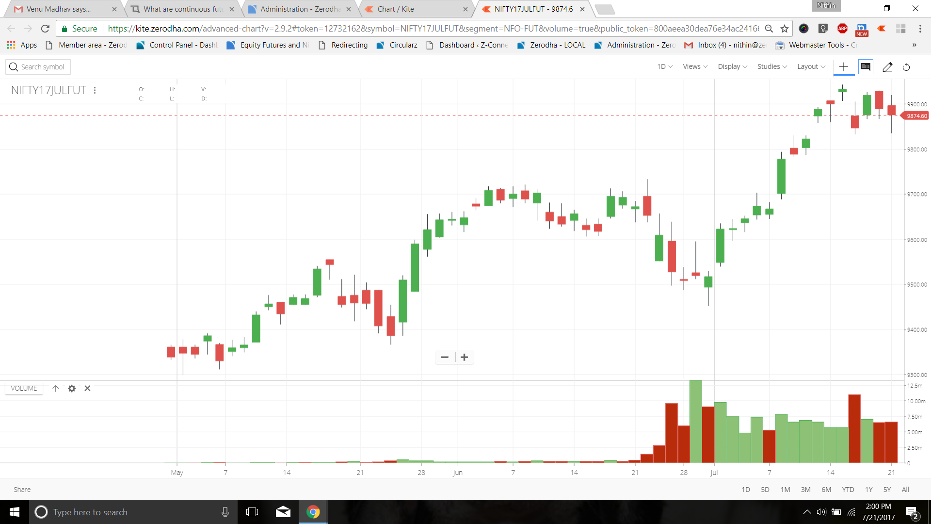
In normal futures charts - if you are looking at say Nifty17 July fut, you will have a maximum history of just 3 months (since all F&O in India have maximum contract duration of 3 months). So if you want to check how Nifty futures has behaved in the last 3 months, if you open a normal July future chart, below chart is what you will see. Chart history only from May 2017 and liquidity and volumes only from June end. If you want to see a longer term chart, you’d have to open the Nifty index (underlying) to analyse but not the futures chart.
There is another option now - Continuous futures chart. ![]()
Continuous futures chart categorises all historical future contracts into current, near, and far months. So when you open a current month historical chart, it pulls data from all current month historically, plots and displays the chart. So in July - July is the current month, in June - June was the current month, In May- may was the current month, and so on. All that data is combined to show one continuous futures chart.
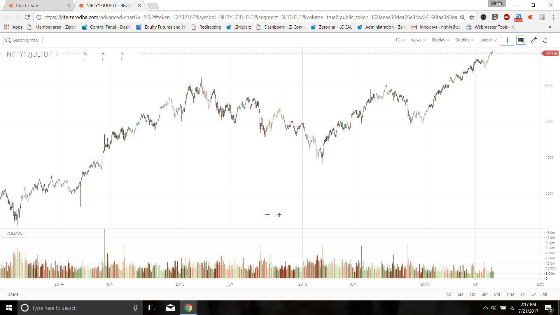
Now find below the same Nifty futures July chart with continuous data set. You can see candles from 2013 instead of just from May 2017. We have equity and index futures data from 2010 onwards.
Since continuous charts are for spotting longer term trends, it is enabled only on daily candles.
We will soon have it for commodity and currency as well. This will be an important utility for commodity futures considering there is no option for an underlying chart like in equity.