pls ignore the other stuff .
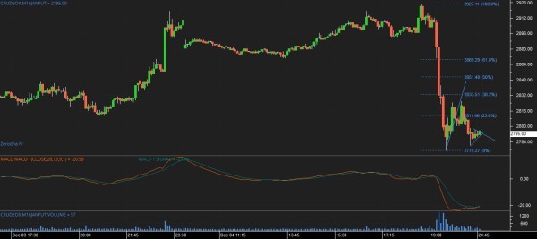
i tried MACD tech. analysis i want to understand what the orange line and blue line show..... how do i interprete this ?
it also shows MACD = ( random numerical values ) .
pls explain in detail

pls ignore the other stuff .
i tried MACD tech. analysis i want to understand what the orange line and blue line show..... how do i interprete this ?
it also shows MACD = ( random numerical values ) .
pls explain in detail
Remember all technical analysis revolve around with just 5 components. O,H,L,C and Volume. One of the reasons why most of the traders fail is the fact that they mechanically use technical analysis without understanding its relevance and its concept. Now let me come to the specifics. MACD components are A) Difference between longer EMA and shorter EMA [1) shorter EMA (12day or 13 day, etc) 2)Longer EMA (typically 26day) ] B) 9 day EMA of the difference between longer and shorter EMA. A is called he fast line (orange line in your pic) and B is called the signal line (blue line in your pic). The thumb rule is whenever the fast line crosses above the signal line buy signal is generated and a cross below the signal line sell signal is generated. Psychologically, crossovers and macd reflect the shifts in power between bulls and bears. Fast line reflects mass consensus over a shorter period of time and signal line reflects mass consensus over a longer period of time. You can relate this concept to your picture above.
MACD is very effective in determining reversals of trend. To be precise MACD histogram is used for this. It provides a deeper insight of the strength of bulls and bears. MACD histogram is nothing but the difference between fast line and signal line (A and B, ie, Orange line minus blue line). Difference is plotted as a histogram.General rule is the rising histogram means bulls are becoming stronger; falling histogram means bears are becoming stronger. The most powerful signal of MACD histogram is divergence. Bullish divergence occurs towards the end of downtrends where prices drop to a lower low whereas histogram traces a higher bottom than during its previous decline. This is a sign of trend reversal. Similarly bearish divergence occurs towards the end of up trend where prices move to a higher high whereas histogram traces a lower high that during its previous high. Hope this helps.
In continuation of my explanation I would also like to highlight the bearish divergence in your chart. On the right side in the price chart you have a higher high whereas in the same period the MACD line below shows a lower low. Histogram reflects this more visibly.
i did just one trade , based on bar analysis only.
if i would have followed the MACD signals , how many trades did it signal ?
Crossovers do have the tendency to produce frequent signals which when followed judiciously will not produce economic trading results. MACD crossovers need to be used in conjunction with other indicators like RSI , ADX, etc. However MACD histogram divergences are less frequent and more powerful. This indicates a trend reversal. For example, in the latest Reliance daily chart you can witness that. Price having formed an higher high whereas MACD line has a lower high. This is the divergence. The most important thing here is this needs to be witnessed in MACD histogram as the breaking of the centerline between two indicator tops is absolute must for a full divergence which is visible only in histograms.