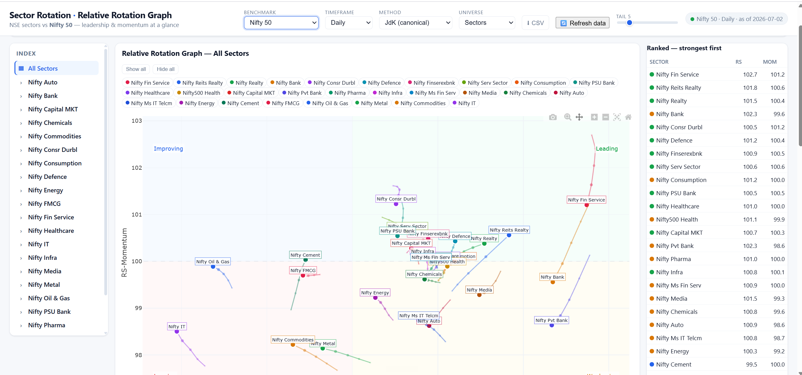
If you’ve ever wondered “which sectors are actually leading the market right now, and which are quietly fading?” — a Relative Rotation Graph (RRG) answers that in one picture.
Here’s the idea in plain words. An RRG plots every sector against the overall market (here, the Nifty 50) on two simple measures:
• How strong it is compared to the market (left = weaker, right = stronger).
• Whether that strength is rising or falling (bottom = falling, top = rising).
That splits the chart into four zones:
![]() Leading (top-right): strong, and still getting stronger. Where the market’s strength is right now.
Leading (top-right): strong, and still getting stronger. Where the market’s strength is right now.
![]() Weakening (bottom-right): still strong, but losing steam. Yesterday’s leaders starting to cool.
Weakening (bottom-right): still strong, but losing steam. Yesterday’s leaders starting to cool.
![]() Lagging (bottom-left): weak, and still fading. Usually best left alone.
Lagging (bottom-left): weak, and still fading. Usually best left alone.
![]() Improving (top-left): weak, but picking up. Early movers worth watching.
Improving (top-left): weak, but picking up. Early movers worth watching.
Sectors don’t sit still — they tend to rotate clockwise over time: Improving → Leading → Weakening → Lagging → and back around. The small “tail” behind each sector shows the direction it’s travelling, so you see where it’s heading, not just where it is.
How to use it: instead of guessing, you can see at a glance where momentum is flowing — so you lean toward strength and steer clear of sectors that are quietly weakening.
One honest caveat: an RRG shows relative strength and momentum — not a buy or sell signal. A sector looking “strong” doesn’t make every stock in it a good buy. Always check the actual business and its numbers before acting. Think of the RRG as a map of the terrain, not a set of directions.