Hey sure, will check with the team if this can be done
We’ll look into this. Thanks for the feedback.
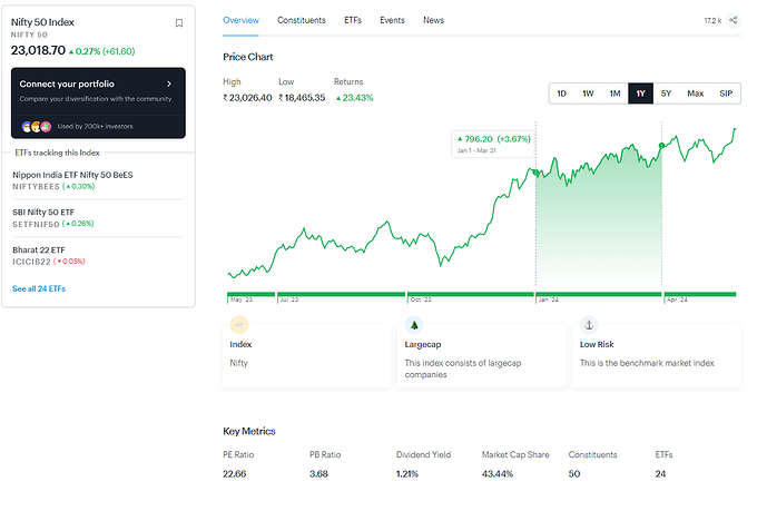
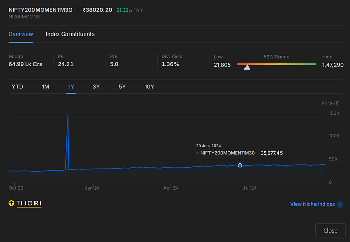
While I like Tijori timeline and various features, but I really miss the return graphs from the previous version of fundamentals from tickertape. Current version of tijori shows the price trend over the past 1 month, 1 year (default option), 3 years and 5 years.
But there is no way for me to instantly judge the return pattern. For instance, if you see the Nitfy from tickertape, I can move from qurater to quarter and instantly see the returns for every quarter over the past 1 year. So my feature request is – please given an option to see the returns over the same windows, past 1 month, 1 year, 3 years and 5 years.
Thank you so much!
Understood, will try to incorporate this
Also, when it was tickertape, it used to show the underlying index of the ETF when we clicked “Fundamentals”
This is not shown now so we do not know what index the ETF is tracking when it is not so obvious from name.
Eg: NSE: MOMENTUM’s underlying is shown on tickertape ![]()
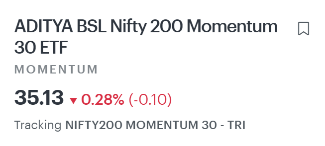
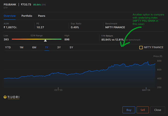
If you have the underlying you can also add it to the graph here and we can compare deviations/tracking error
Hi, sure got your point. Will try to add more granular indices for the ETF’s in upcoming releases
Hi @Tijori_Finance ,
When will you start to show news about the stocks? Badly missing the news feature.
Hi, will get done it done in the next couple of weeks. We are integrating with reuters and testing is on.
What happened to the partnership with tickertape?
@Tijori_Finance any update on this feature? We are in the market for returns, not prices. This is the most fundamental and important feature, which you are lacking. I have to go to tickertape to get this information.
Requesting again: can you show return trends instead of price trends?
Whenever you select 1m, 1 year, ytd etc you can see returns next to price for the selected period.
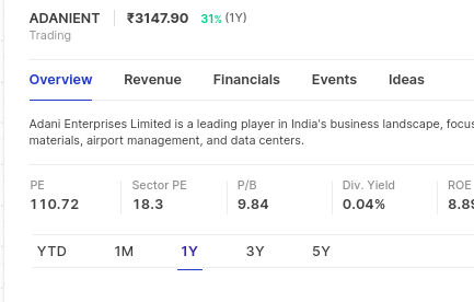
Hi @Tijori_Finance , please use more colors. Everything is blue, very hard to understand the charts.
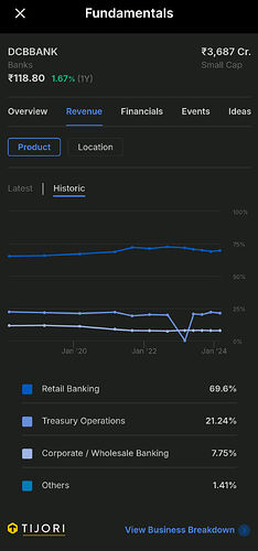
Also when you click “More info” or “View business breakdown”, it opens the kite login. It should just open the business page or the stock’s home page on your site.
It is very annoying to enter password and otp to view stuff when it is publically available to view on your site without login.
Hi,
Thanks for the feedback, addressing the 2 points below:
- More colors in charts on dark mode - Yes sure, this is noted we will look into some more options to improve the contrast
- Clicking more info - Yes- we are aware there are some issues while re-directing from Kite, we are working on it. Transaction from kite to the company pages will be smooth post that.
Hi , pls add cap and sector info for portfolio stocks in overview and breakdown view of cap and sector for portfolio stocks , Thanks.
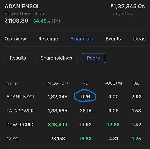
Hi, latest TTM EPS is ~1.23 , so maybe some websites are adjusting for extra ordinary items to give the PE
We do not so that so that there is comparability across all companies. We noticed companies have leeway in what is an extra ordinary item
Hi, thanks for flagging this.
We will have this reviewed right away.
Is it only me who doesn’t like the font used in Tijori platform?
