I don’t like their UI in general. Should bring back tickertape
Hi, since we have received this feedback from quite a few users we are changing the fonts. New fonts should be out soon!
I feel Tijori has lot of work to do to simplify information for its users. Take screener.in for example. I haven’t found any other website that would present information better than them.
Tijori is good, but it still has to simplify the information on its platform. I wish I can track everything on Zerodha itself, and hope you will improve the experience of Tijori overtime.
Hi Banerjee,
Yes we have received feedback regarding the fonts & we will be pushing an update by the end of the week with clearer fonts. Dark mode is in the works too.
Hi Rahul,
Thanks for the feedback.
We have collated quite a few inputs from users regarding the UI and will be rolling out fixes starting with better fonts which should be out by the end of the week.
Will keep posting here as & when we roll out a new enhancement to improve experience
Hi, we have chnaged our fonts on the company page and financials. It will be rolled out application wide incrementally ![]()

I am writing to express my appreciation for the recent font changes made to the platform. However, I would like to see these font changes applied consistently across the entire platform for a uniform user experience.
Additionally, I have some suggestions and requests for further improving the platform:
-
Fundamental Data for Indices: Currently, data is not available for indices. It would be beneficial to provide fundamental data for indices.
-
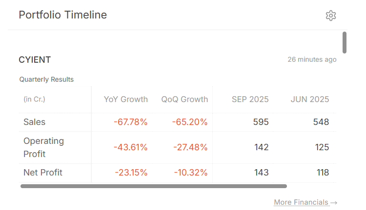
Timeline Display Issue: The timeline section does not display properly at 100% view but appears correctly at 90% view. Please investigate and address this issue.

3.Peer Comparison Section: The peer comparison section is currently under the Overview section, requiring extra effort to access. Kindly move this section to the financials section or create a dedicated section for peer comparison.
4.FII and DII Data in Shareholding Section: There is an issue with obtaining FII and DII data in the shareholding section. The layout of this section is different from other websites and needs improvement to align with common standards.
5.Alignment of Financials Sections: The current alignment of the financials sections is not optimal for analysis. A suggested alignment could be: Price, growth table, Quarterly results, Profit and loss, Balance sheet, Cash flow, Cash flow analysis, Ratios, Reverse DCF. This would help in analyzing step by step.
6.Dark Mode: Adding a dark mode option would be beneficial for users who prefer a darker interface, especially for reducing eye strain.
7.Different Color Themes: The current yellow theme might not be to everyone’s liking. Providing different color themes would allow users to customize the platform to their preferences, enhancing the user experience.
I believe these changes will significantly enhance the functionality and user experience of the platform. I look forward to seeing these updates implemented.
1 Like
Hi, will get the timeline bug checked up.
As for the enhancements, dark mode is on our list of things. Will evaluate the rest of your requests as well.
1 Like
@Meher_Smaran @Arockiya_Raja
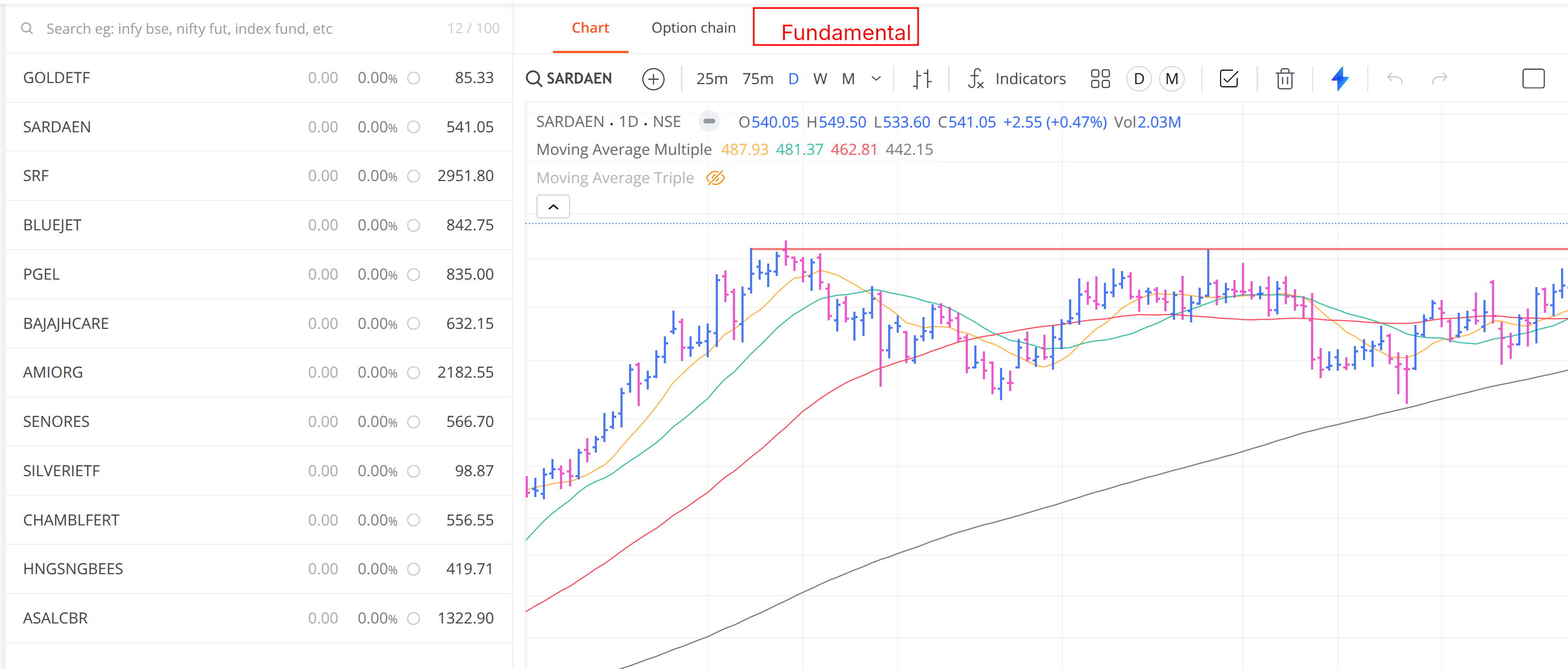
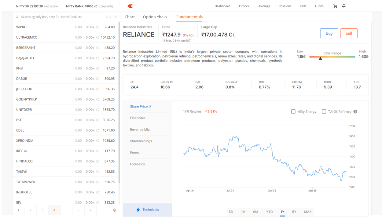
Can we get fundamental on the top bar. It will be quick to access the Fundamental pop alongwith the chart for quick glance if charts looks good. It wil be helpful to find out if the chart is driven by Fundamentals or not.
3 Likes
Yes, that’s the plan. Fundamental and technicals will be added here.
4 Likes
That’s great ![]()
![]()
Hi , screening on ETF’s are not possible right now on Tijori unfortunately, only stocks
Amazing
1 Like