@siva-reddy
I hope this becomes possible soon.
Agreed, multiple pop-out will be very useful!
Is it possible to show the info of Withdrawable & Available amount in dashboard just below Opening balance show it is easy for the user to track the changes happening in their account instead of navigating to another page
In this new Kite Web update, there is large empty space on both sides vertically.
is this for everyone ? must 150px X2 left and right margin.
Pls fix this if its there and use full width of viewport.
Edit: max-width:1366px: <— this style
2 Likes
Simply superb. And new order window is great. Thanks a lot @siva-reddy @nithin and Z team for this eye catchy update.
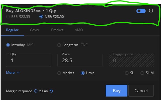
Can we have order window border color maintained (Red/ Green for Sell/ Buy) in dark mode too as of dafault mode for buy and sell?? This is missing
1 Like
It is always like that right? I mean not specific to this update.
Till yesterday i used to see full width both sides. ( very small margin in few px if there ever was )
Now it is constrained so on 1600px 15.6" laptop screen there is huge margin on both sides.
On larger desktop monitor it becomes worse. We should use the whole screen and i’m using for many years now so such changes are easily noticed 
You can toggle between buy and sell, you can easily see for buy all options will be blue and for sell it is orange.
It is always like that right?
No @siva-reddy
If you scroll up in same thread, you can see full snapshots of other users. it was like that.
see post # 2331, another user 2334
all have very minimal margin both sides.
now see the space wasted, it looks too narrow, and its being limited by 1366PX hardcoded.
current image
this is considerable space.
sorry, but it is a lame answer. I dont want to fill the space with over-sized fonts and buttons.
that UI experience is worse then it already is.
@siva-reddy @nithin i believe your words , the dark mode on time in zerodha , i love it , now a days there is no technical glitches in zerodha , the execution speed is i seen is ultrafast … i love it its really amazing
one more thing still pending one more is MAGIN FUNDING when we can expected , if you fulfil this one zerodha is almost complete everything
@nithin @siva-reddy hai can you see the kite web i created a apps inside of kite web , we have some space in both left and right side , for a quick look and quick access we can add a apps on the side , so for me doesint want to search back office scrrol up and down no need , through quick access we can access those app immediately , this is my opinion …

1 Like
It’s very disturbing. All those apps available in bookmark space or few clicks away. But @siva-reddy seriously that space should expanded for KITE.
ok , then good lets we need atleast to expand
1 Like
It will take some time.
1 Like