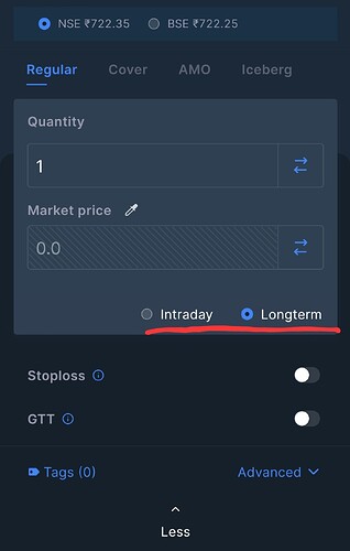
The new order window which was recently changed by Zerodha can be said as the worst update they have ever made. I suggest you Zerodha to roll back this as soon as possible or give option to traders to switch back to old order placement window.
what’s not good about it?
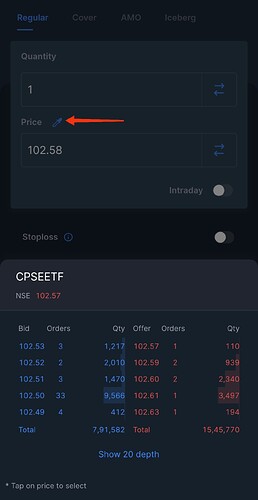
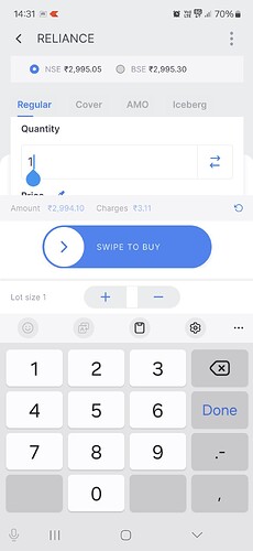
Firstly when you select quantity then price tab is hidden by keypad, then you have to drag the screen and select price.
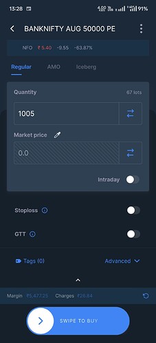
Secondly in price tab, market order is preselected so you have to manually change it to limit order.
Thirdly, no way to see market depth while placing order.
Lastly disclosed tab is so much hidden. So much work to do and in hurry chances of mistake too much. Had chosen zerodha because kite app was best. Sadly app is deteriorating update by update
You can click on the Knife like ![]() icon next to the Price tab, to check the Market depth while placing the order.
icon next to the Price tab, to check the Market depth while placing the order.
Once you change to limit order that selection will be remembered for next invoke.
This should not happen, can you share screenshot ,please.
This should not happen, will arrange a call to you, can you DM me your client ID?
The Type of Order Setting which is remembered through cookies?
OR
Kite internally saves that Setting like you Save Preference for Chart Type etc?
Because browser cookies gets cleared at closing of browser (at least for users who set their browsers that way).
Not saved at server level, we save at cache level.
Okay…
But you can make it persistent… It will help users who uses different devices or use Private Browsing or similar settings. Just a suggestion…
Why do u need a full screen tab for qty and price? The price is not going to be in crores neither then qty. Then what’s the points of keeping such big tab?
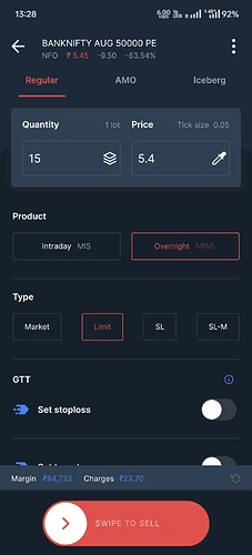
This is the worst UI ever for order placement… we have got used to older one. Pls roll it back. Or give option to choose between both.
Take a poll and see how many like this order window and how many not?
Unrealistic design by the people who have not used mobile for order placement.
i agree. i think for new guys it would be challenging at first. especially with no initial confidence, this is a nightmare.
I prefer the old order window because it was similar to the one on the web, making the experience seamless for traders who use Kite on both web and app.
However, the new order window is completely different from the web version, which causes confusion as it takes a few extra seconds to understand how to fill in the details and which toggle buttons to use.
I request the Zerodha team to switch back to the old order window on the Kite app since it was the same as the web version.
We are making couple of changes, give us a week more, try after that and please let us know your feedback, we are open to act on it based on possibility, thanks.
Sure, looking forward to it.
![]()
![]()
Pls just revert back to the original old format. It cannot be simpler than that. If u people really value the opinion of ur users, take a poll online and check for urself how many vote for the new one and old one…
Then what will UI developers write in their resume?
What will the Product Owner list as achievements during their annual appraisal?
Aise kiyaa to next year,
promotion to door, increment bhi nahin milegaa! ![]()
PS: While i write the above in jest, i sincerely hope this is NOT the case.
But, judging by the ongoing lack of basic competency in maintaining/improving the user interface, and the responses trying to justify the mis-steps, over the past few years, it sure looks like a seriously dysfunctional team/org. ![]()
Hi @siva ,
Could you please confirm if this is the change you were referring to, or are there additional changes expected?
Putting long tong term is wrong there. People will think zerodha won’t allow them to sell it short term
CNC was the right word but a bit unknown
@siva
I still prefer the old order window since it was the same as on the web. The new order window on the Kite app is completely different, which causes a lot of confusion.
It’s easier now for simple orders like intraday or delivery buying, but it becomes very confusing when trying to use an SL buy/sell order. Now, the SL option is provided as a slider, making users think it will automatically place an SL order to protect the buy order they’re placing. The old order window didn’t cause this confusion because SL and SL-M were separate order types.
