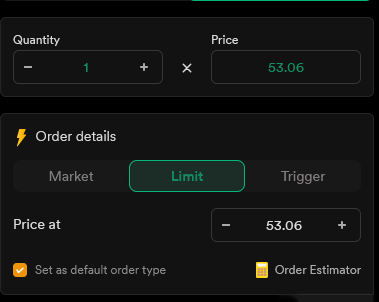
I have never seen any app where “+” button is placed on the left side and “-” button on the right side.
Please see the snapshot for Dhan order window where the buttons are placed correctly. Can you guys ask your UI team to fix this?
I have never seen any app where “+” button is placed on the left side and “-” button on the right side.
Please see the snapshot for Dhan order window where the buttons are placed correctly. Can you guys ask your UI team to fix this?
Let me check with our team.
Zerodha tech team keep saying lot of thought given to make these changes but then how these basics are missed?
its their Baby , Once had , cannot change it !!! ![]()
Yes, this is simple. I will update you on this within a day or two.
Why is this hard to implement, dont you guys think this is something basic?
Just need some setting on the profile tab which says “Default Qty”
Still waiting to get this fixed.
@Arockiya_Raja any update or not important to fix the issue? Just getting frustrated on the long waiting period for a simple UI fix.
This has been the behaviour from the start. I understand that this isn’t the standard position. The change may appear minor, but adjustments to long-standing features can impact user workflows, so we want to approach this carefully. I appreciate your patience. I’ll share an update on this next week.
@Arockiya_Raja our brain takes most of the decision in sub conscious mode. All apps have “+” on RHS barring Zerodha. So, I have personally faced lot of losses due to wrong price being purchased. Now, I have stopped doing any order modification by app to overcome this sub conscious behavior.
Any ETA?
2 weeks
@Arockiya_Raja @siva
Is this possible?
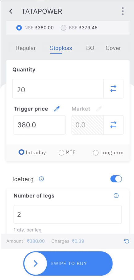
Consolidating Order Types: Grouping Regular, SL , BO*, and Cover in a single row could streamline the user interface and make it more intuitive.
Simplifying Product Type Selection: Intraday, MTF, and CNC in the same row.
Introducing Iceberg Toggle: Adding a toggle switch for Iceberg .
Automated AMO : Orders placed after market hours can be automatically consider as AMO
I believe these features could greatly enhance the user experience.
![]()
![]()
It would be very helpful and simple.
This is being rolled out and should be available in a week or two. It is already live on the web; we just need to remove the AMO variety from the front end.
Yes, we are discussing this.
BO is not allowed in Zerodha now. SL is just another order type, not a different product type like CO. I don’t think displaying it as another tab is suitable. CO is already in the same row. Once auto AMO is fully rolled out, we will remove AMO from the row, and then CO will be visible without scrolling.
Under regular product type, except qty and limit price type, other settings are hidden by default; users can see it only if they click the more button. Displaying it under more buttons will get less visibility. Auto order slicing is being introduced; we can review this later.
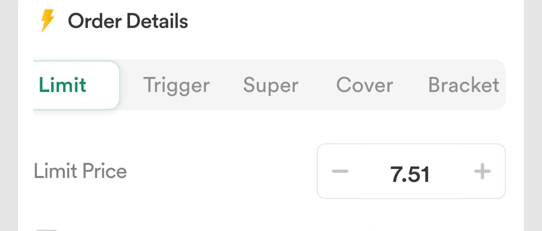
some brokers provide market, limit, stop-loss , and cover orders in a single row, making it seamless to switch between order types:
As per my understanding, AMO will be automated and removed from the tab row, leaving only regular and cover orders. If this is accurate, I believe regular order could be simplified further by ungrouping into market, limit, stop-loss +(cover order).for better usability. like this :
issues with toggle :
The toggle for orders involves unnecessary clicks, making the process less intuitive and time-consuming.
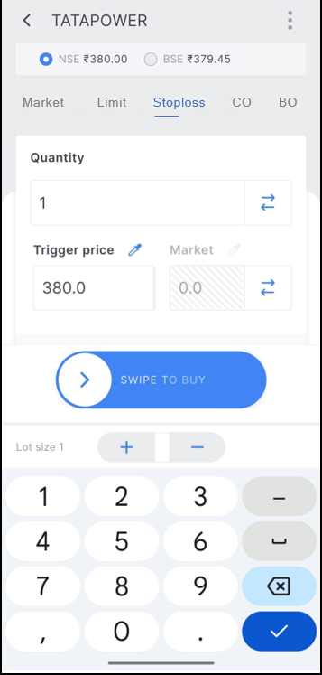
Editing quantity and amount in SL order requires excessive scrolling.
Occasionally, the SL price box fails to appear.
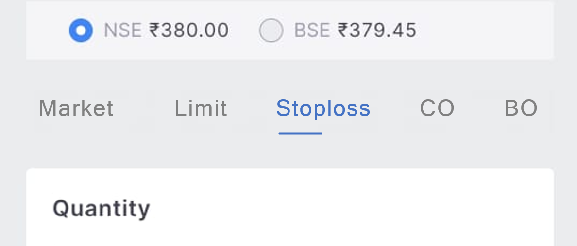
if Market, Limite, SL as separate tab :
If Market Limite SL orders were provided in a separate tab, it would simplify order switching, make the interface easier to understand, and allow quantity and amount edits without the need for scrolling.
I understand that these changes may not align with your current development roadmap, but I wanted to share my ideas for consideration.
Thank you for taking the time to review this feedback.
Woah, this came up in the latest update, thanks Team Z