@nithin @Arockiya_Raja were you able to consider and implement this complex requirement ?
This has been changed in the testing build, which is expected to go into beta this week.
Yes, you can update the app and check.
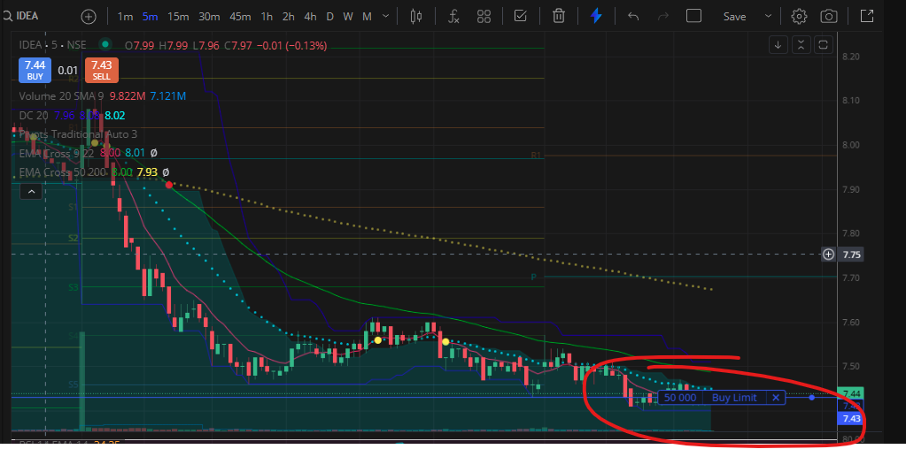
Line looks fine with the price but the text looks intrusive, can you move it to the right of the pan after the line or extreme left side. Or just make the text appear in the background with a light color. The blue line marking the entry with price level is okay.

Thanks ! Please consider the UI changes to be done via experienced engineers and keep it uniform across other apps.
We aim to keep the experience consistent and user-friendly across all our platforms. This was a rare miss that seemed to have gone unnoticed for quite some time—surprising even to us. That said, we’ll be more mindful going forward.
2 Likes