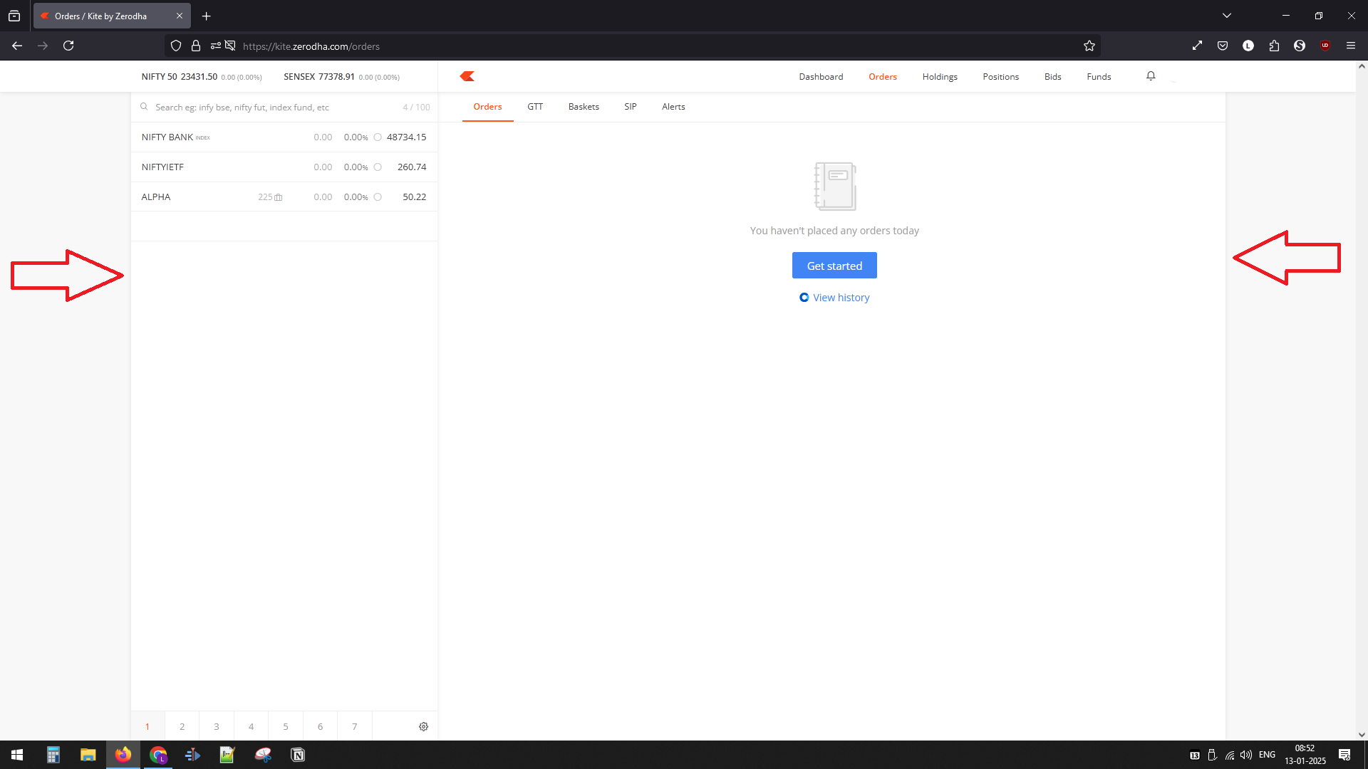
I have a 27 inch monitor [BenQ GW2790 27" 1920x1080p FHD IPS Monitor] and kite session seems to leave space on both the sides.
I’ve attached screenshot of the kite browser session. the display settings are checked, double checked. other sites are working fine - which concludes that kite does not use the extra space on the sides OR it does not identify the screen resolution?
Chrome and Firefox checked - both have same issue.
In my opinion, this is done in order to reduce the screen lag while you minimize the screen keeping the responsive nature intact. The same can be seen for X, where a lot of space is left on both sides
hi @cvs i’m guessing that we need to right click on inspect element and have your code pasted. I tried. could you share a few steps on getting this done please? And i’m guessing this needs to done at each launch of kite session.
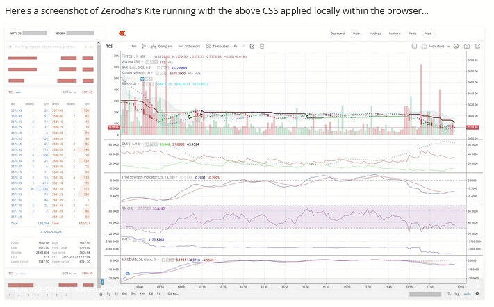
…or one can use a browser extension (eg. Stylus ),
that allows one to configure customer CSS per site/page
that is automatically applied only for the respective site/page.
WARNING - As always, do review the author/source of the browser extension and the permissions you allow it. Download browser-extensions only from trusted sources to stay safe/secure.
Also, you may want to experiment
modifying the values being assigned
(eg. 300px → 400px or 20% → 25%)
to match your display dimensions and personal preferences.
 WARNING - As always, do review the author/source of the browser extension and the permissions you allow it. Download browser-extensions only from trusted sources to stay safe/secure.