I noticed that there have been previous attempts at supporting widescreen Kite using browser extensions.
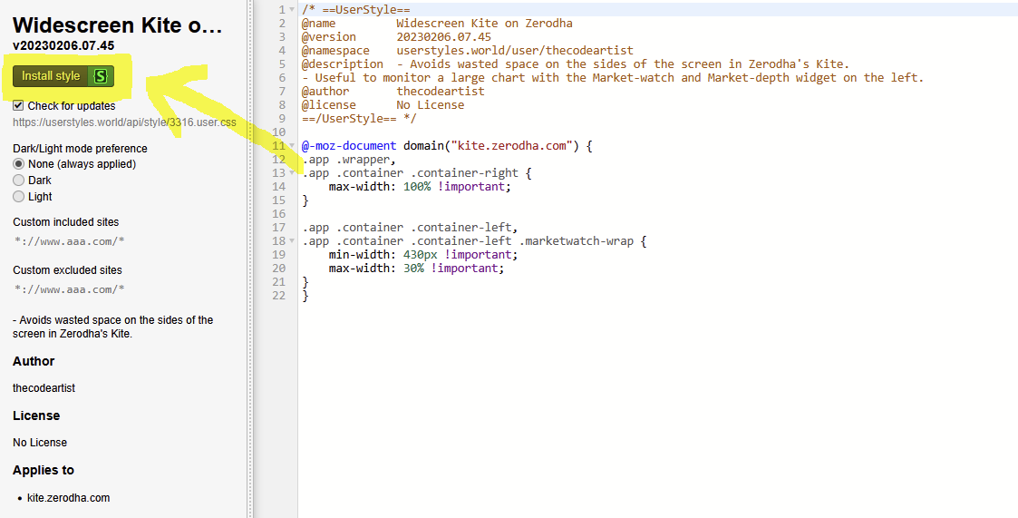
But, it turns out that supporting widescreen in Kite is just a matter of 5-10 lines of CSS!
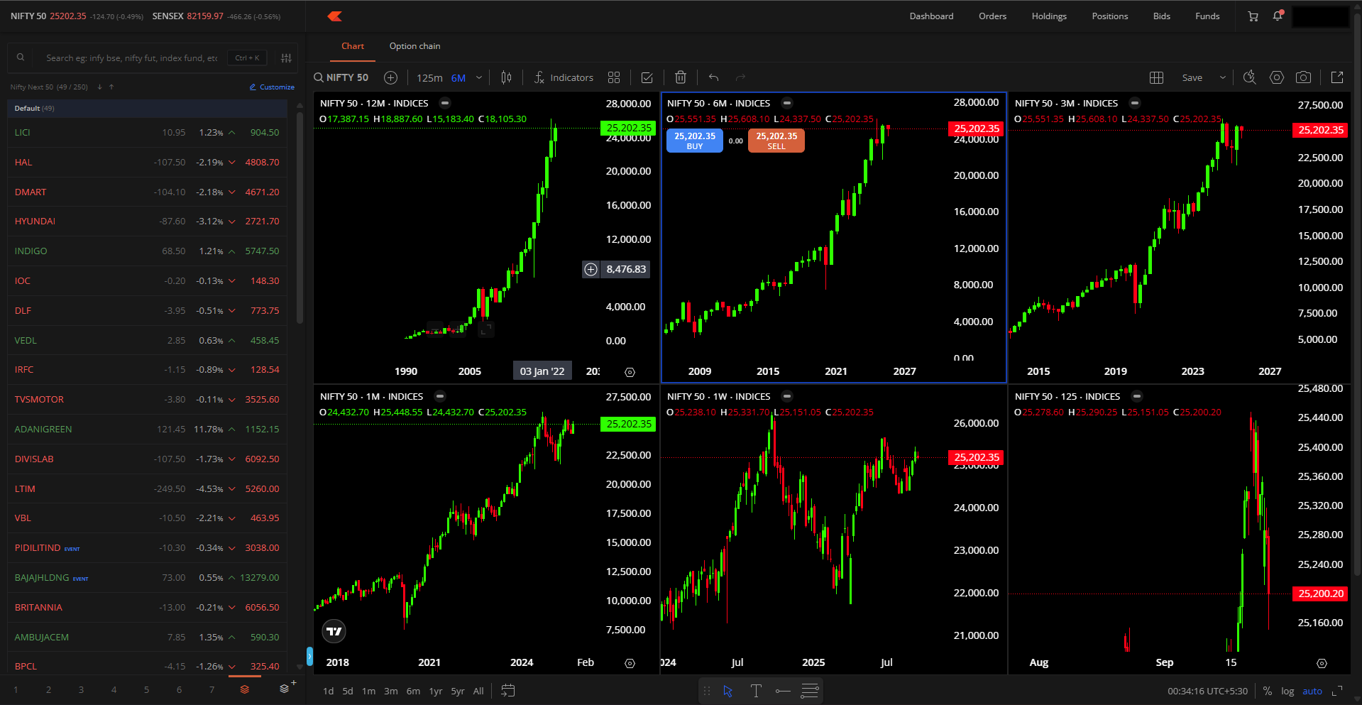
The above CSS allows the MarketWatch and Chart widgets to occupy the entire width of the window/screen.
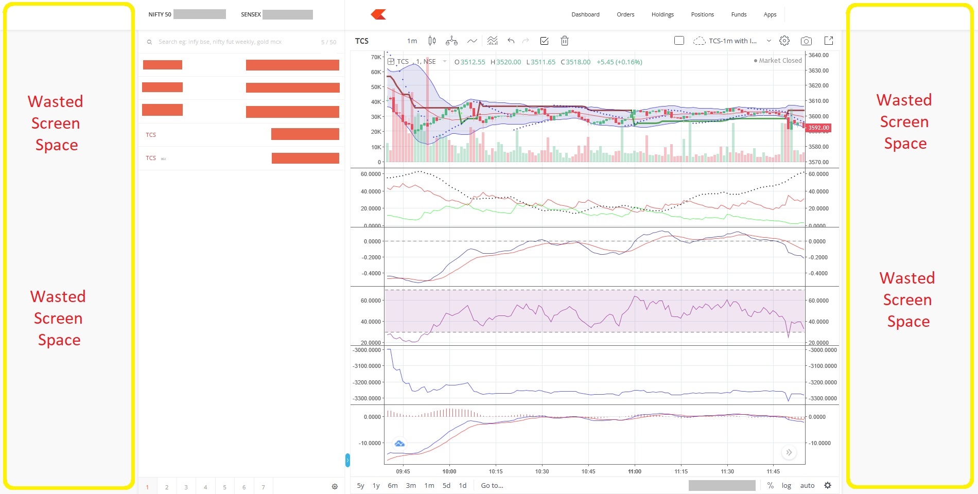
Thus avoiding the waste of space on the sides of the screen in Zerodha’s Kite.
This is extremely handy to…
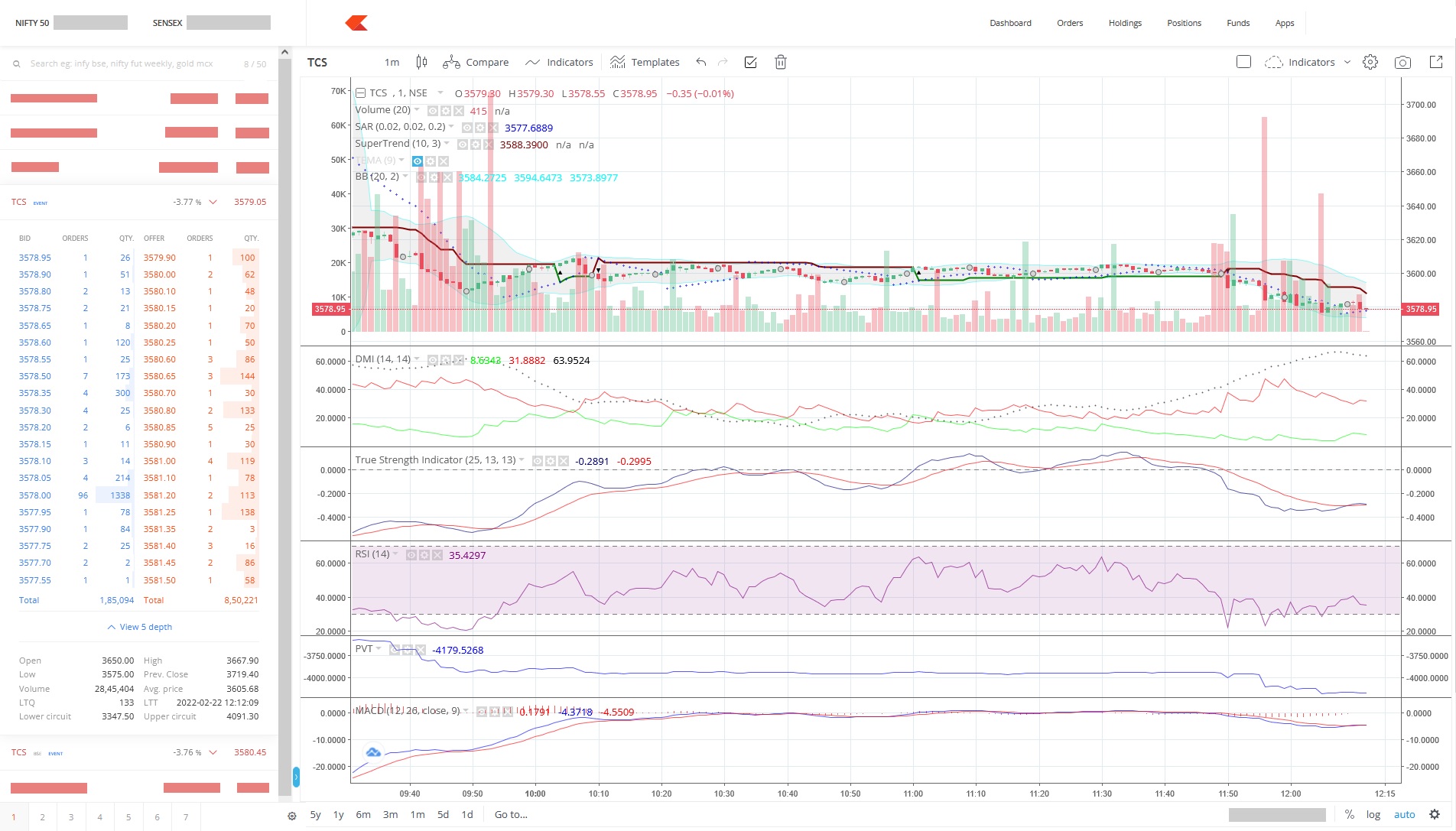
have a large chart with more details / longer timeline visible on-screen.
along with the Market-watch and Market-depth widgets on the left simultaneously.
Here’s a screenshot of Zerodha’s Kite running with the above CSS applied locally within the browser…
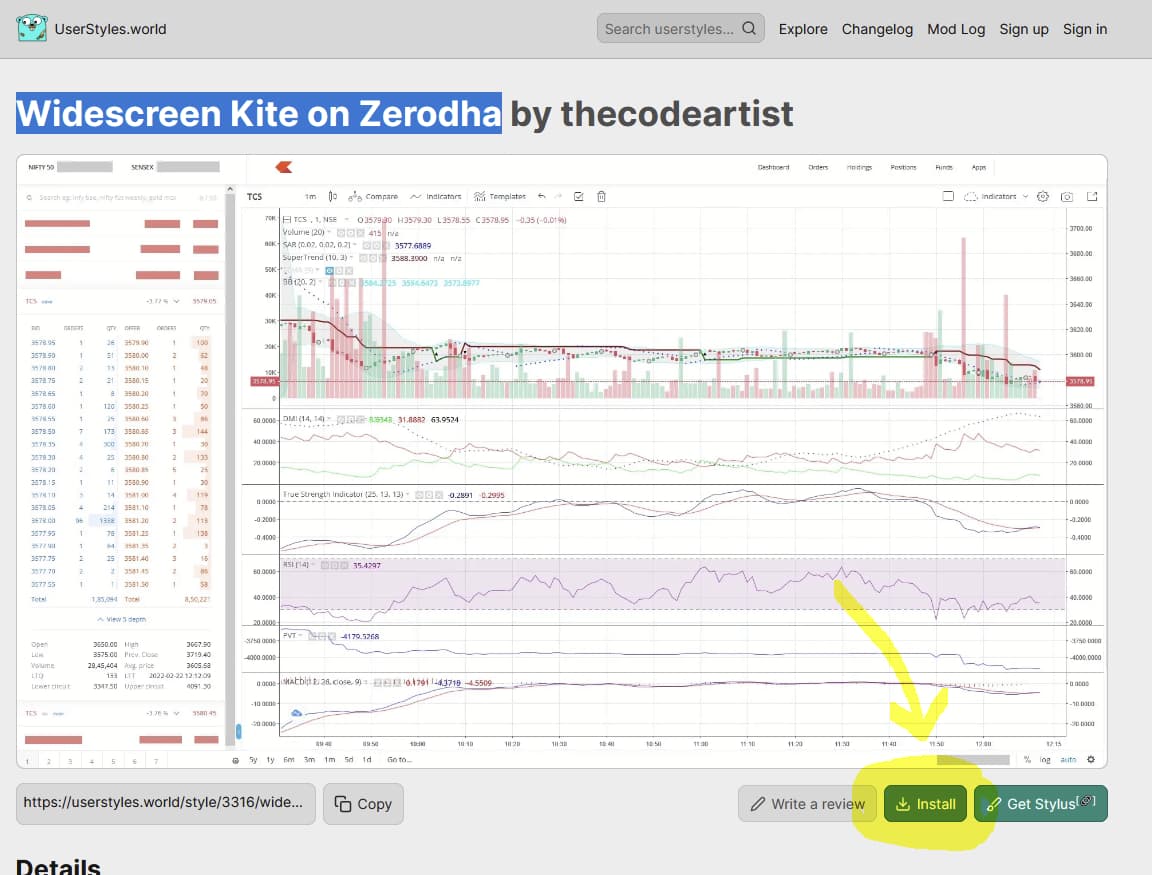
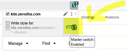
If you use any custom styling extension in your browser (eg. Stylus),
then you can simply import and use the Widescreen Kite style
to enable the above widescreen view when using Kite in your browser.
Hi Zerodha / Kite-devs,
assuming there are some reasons to continue supporting the existing layout in Kite with padding/empty-space on the sides, would it be possible to add such a 10-line CSS customization using a toggle-button in the corner of the Kite web-page/screen to switch between the default and widescreen/full-width layouts?
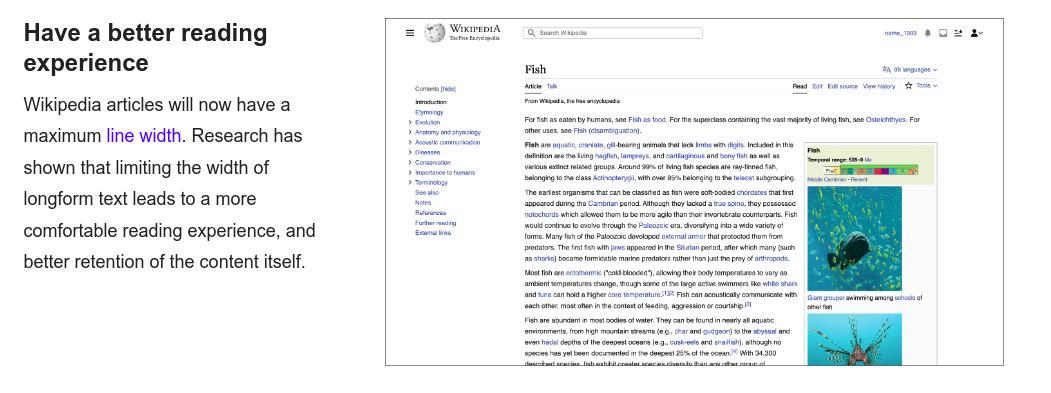
This research paper highlights why line width is important to keep the user engaged.
We think full-width screens work for graphics and disjoint blocks, but not for lines and rows that have to be read from left to right. Reading a table from left to right stretched to 2k-4k pixels will be impossible and hence the blank spaces in between on Kite.
Agreed.
However, am not sure why this bit is relevant to what i requested above -
widening the graph/chart area to use the otherwise wasted whitespace.
Agreed, that would be a pain to use. (also, i was not requesting this though!)
Please checkout the 2nd screenshot in my above post (desired layout)
and compare it to the 1st screenshot (default layout)
to better understand what i was requesting - "The ability to view a wider graph without losing out on the details. instead of the wasted whitespace on either side."
As you rightly pointed out,
one must NOT unnecessarily widen the tabular market watch area on the left,
just the graph/chart area can be allowed to expand to fill the remaining screen-width.
Thanks for sharing Stylus and Widescreen kite style. After a year of frustration [opened zerodha account a year back], finally a relief for me.
Very sad to note that some “we think” people think reading ‘long line text’ is same as ‘reading table line’. Also, when you hover mouse on a row, it gets highlighted so problem reading it at all. These “we think” people seem to have so much ego that they can’t implement toggle button as suggested which would be inclusive approach for users and shouldn’t this be the open-source approach. “we think” seems so much “close mindedness”, “my way” approach.
Please note, i am not criticizing people but idea of not implementing toggle button.
Yes wide screen layout is really desirable.
Its really surprising that such a leading broker of India is still using this narrow layout for its web trader interface. In spite of being one of the oldest broker platforms and one of the pioneers in this Industry with many unique features it has still not enabled such a basic feature like wide screen layout. Most other discount brokers have wide screen layout by default.
They should enable it at least with a toggle button as suggested by @Prateek_Shukla .
Hi @cvs
Hi @cvs
Will you please explain how are we supposed to use the CSS code given in your post
to enable wide screen layout for Zerodha kite?
Sorry to ask as I am from non-IT background so do not know how to add this code in our browser to enable the wide screen layout for Kite.
Thanks
Remember to review the permissions requested by any browser extension before installing it.
Also, ensure you understand the styles/scripts that you install.
Depending on the permissions allowed and custom code being added,
one might expose one’s personal data.
While i can attest that there is nothing malicious in this “Widescreen Kite on Zerodha” style, being discussed above in this topic-thread, scammers/hackers will also say the same about something that they might be pushing.
Step1. Can install the stylus browser extension for the browser.
So we do not need to keep waiting for the Zerodha team to enable this wide screen layout by default. Let them have their own excuses and hurdles and let them take their own time.
Until then we are sorted.
Just a bit of concern about this extension.
Hope it should be safe to be used with our Zerodha log in credentials.