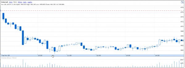
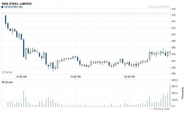
One of those most asked questions out there. See below intraday 5 min chart for Tata steel 25th Nov from NSE Tame, Google finance and Yahoo finance respectively.


As you can see all the three charts are not really the same, so which one is correct?
Am copying from one of my previous answers:
Something for you to know:
Tick Data: Market data that shows price and volume at every print, it also includes information about every change to the best bid and ask.
In a single trading day, there are millions of such ticks recorded (remember this also includes change in best bid and ask prices) and it is technically not possible for any trading platform to show all ticks, especially live and on a normal broadband internet connection.
If you really want to see all the ticks, NSE does have Tick by Tick data feed which is a lot more expensive than the normal data feed, and will have to be subscribed to througn any of the authorized NSE data vendors (Not all of them give you tick by tick data). Also to be able to make best use of this tick by tick data, you should ideally be on the NSE collocation which would mean that your systems are inside NSE itself, so that accepting all the millions of ticks will be quite efficient.
Tick by Tick data is usually what professional High Frequency and Arbitrage trading firms use, don't think there is anything much a normal retail trader can do with it.
Coming back to the question, all charting platforms are driven by data which is basically a 1 second snapshot data (unless you have spent a few lakhs to get that TBT data). So if I am looking at a 5 min chart, there could have been thousands of ticks in that 5 mins, but our charting platform would be able to recognize only a few hundred. And using those few hundred ticks, 1 Open, High, low and close points are chosen to plot the candle. So these few hundred points recognized, and the 4 points (OHLC) could very easily be different from one platform to another.
So none of the above charts are wrong, but the chances of any two charting platforms to exactly match each other, is very slim. But like you can see from the above charts, the difference is quite small, and the general trend of the market is captured by all the 3 charts. I am sure you can add charts from a few more platforms and they will all have some kind of variance.
So if you are a trader, don't break sweat on this. It is not possible to match two charts and find out which one is more correct. They are all most likely right.